20 Pixel Perfect Power BI Page Layout Guides
Apply these grid layouts to get uniform looking reports every time
I see a lot of Power BI reports, and the first thing I can always spot is misaligned visuals. Even being a pixel or 2 out can make the report look sloppy and unprofessional.
To be fair, it can be quite tricky in Power BI to get consistently sized margins between all of the visuals and making sure everything is aligned.
Yes you can use the align and distribute visuals button, which definitely helps but still doesn't make it easy to keep a consistent layout across pages.
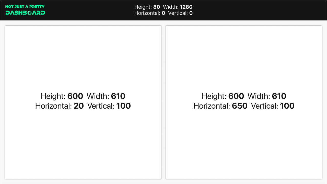
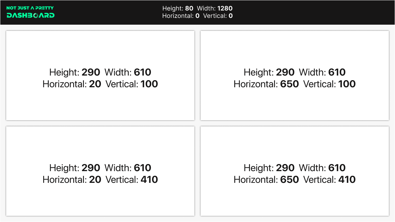
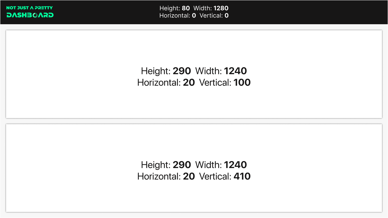
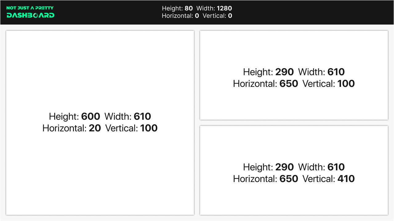
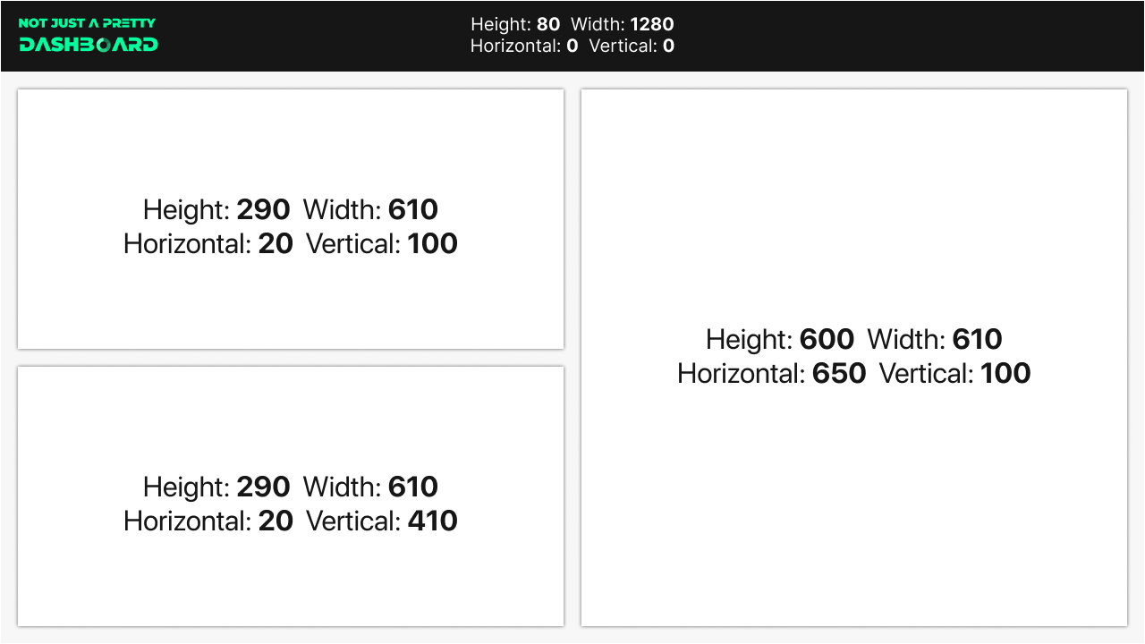
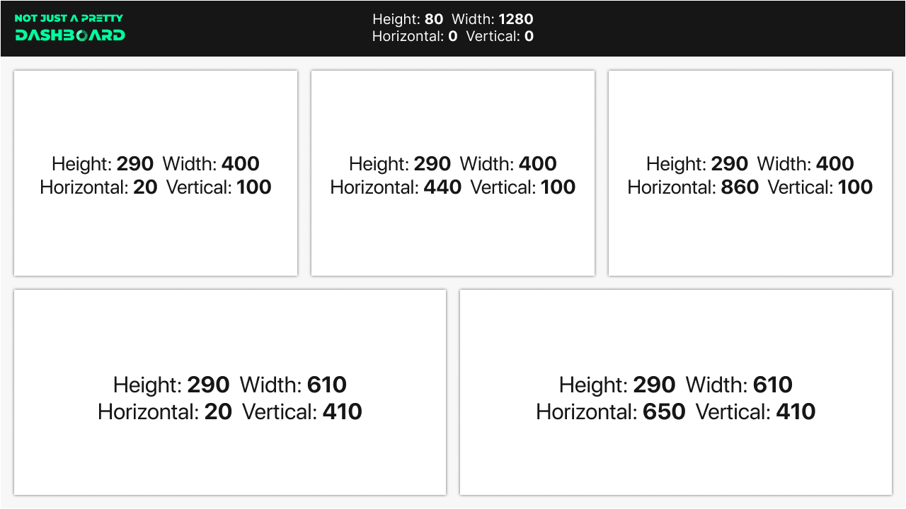
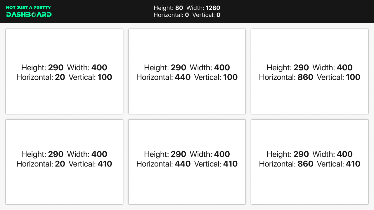
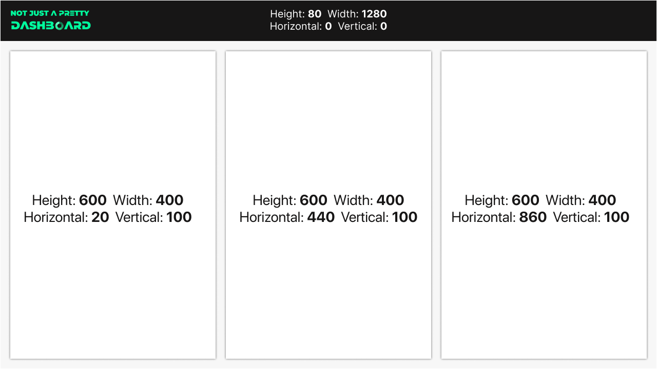
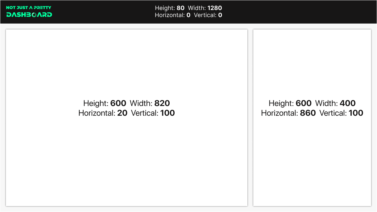
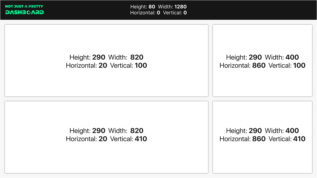
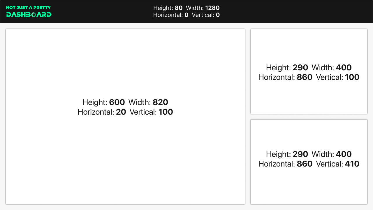
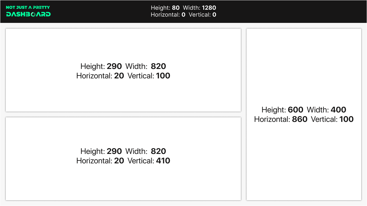
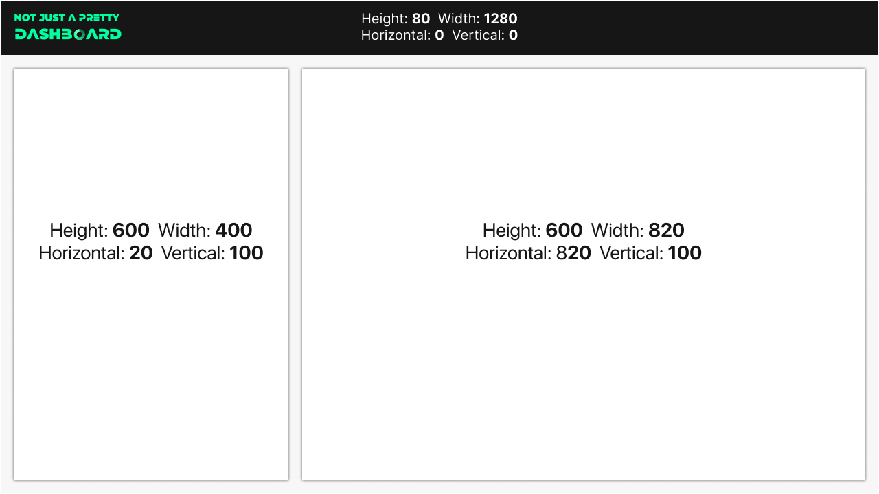
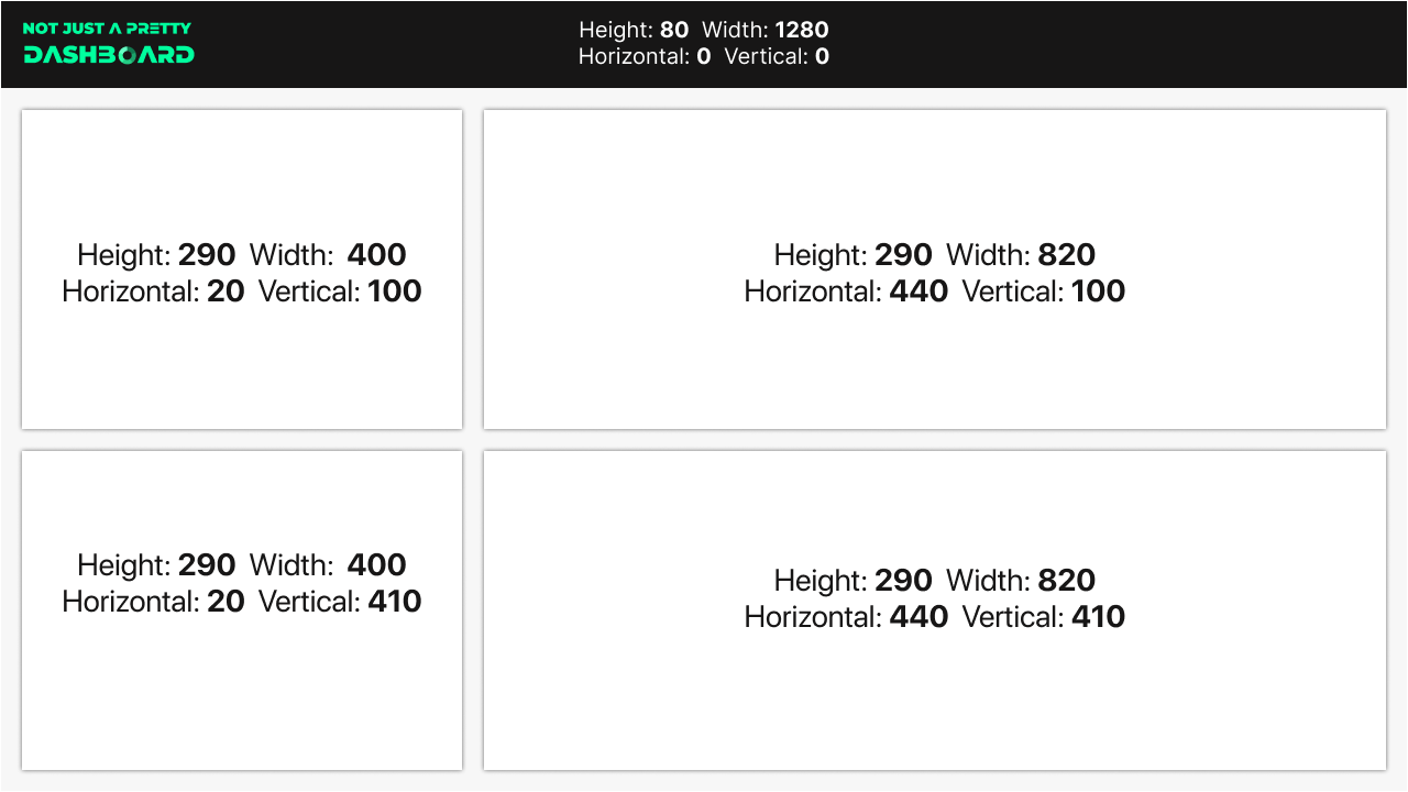
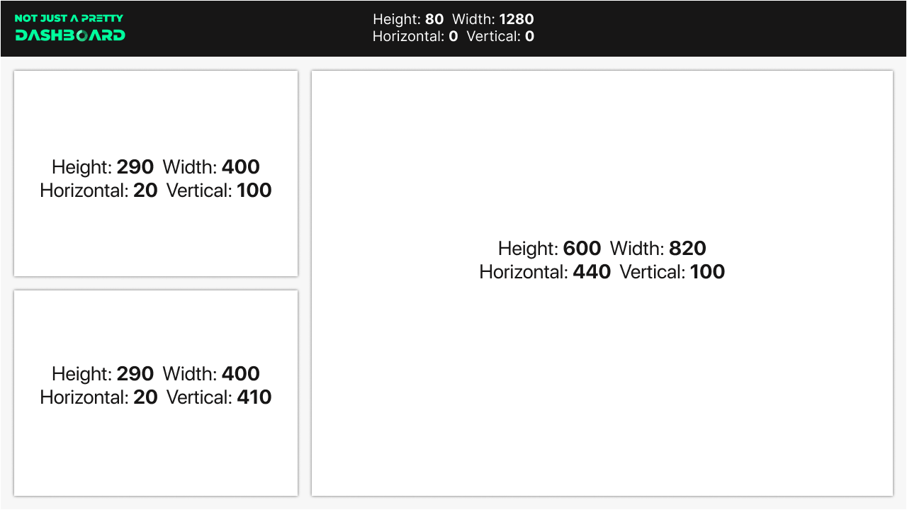
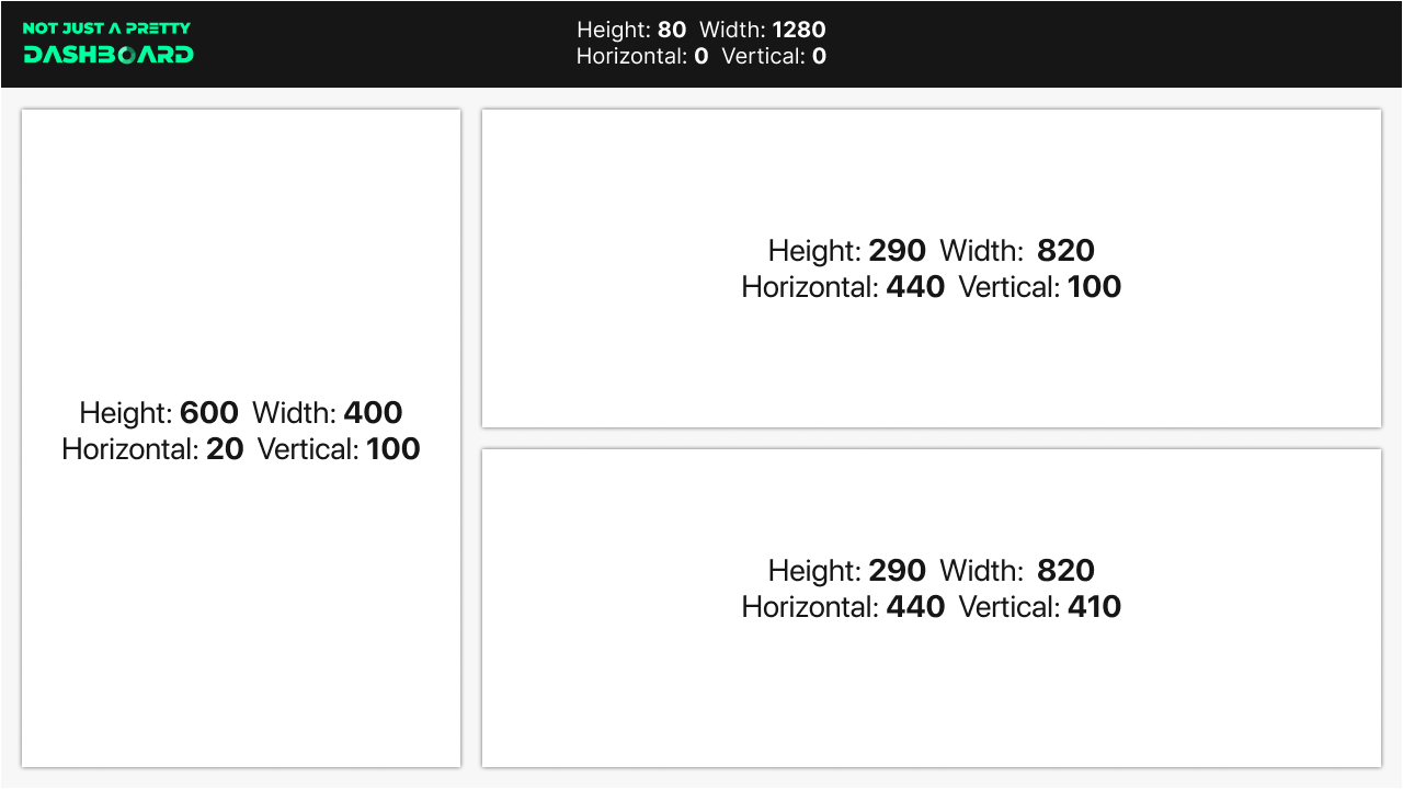
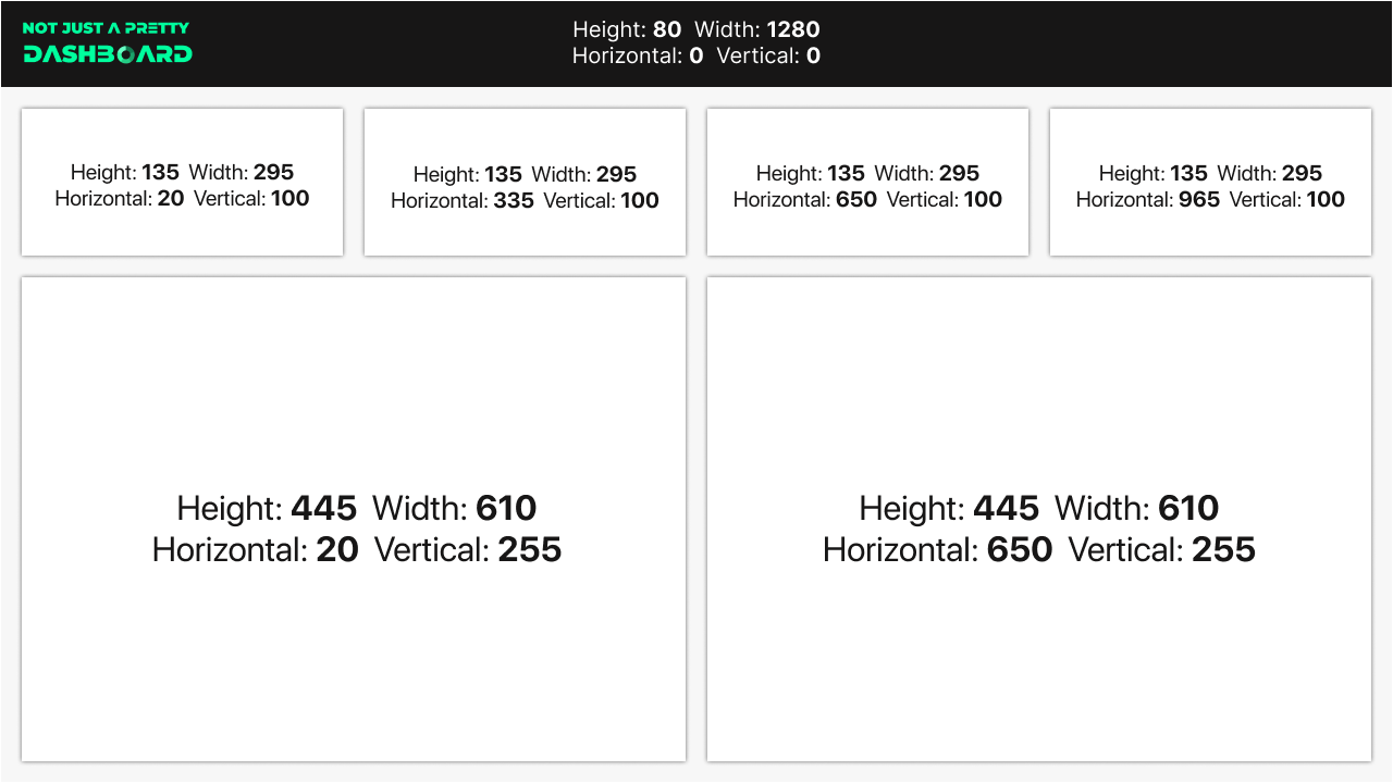
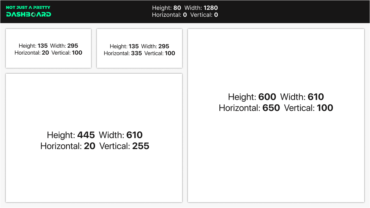
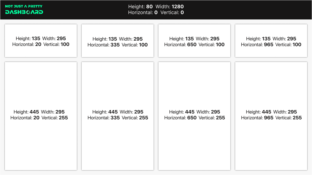
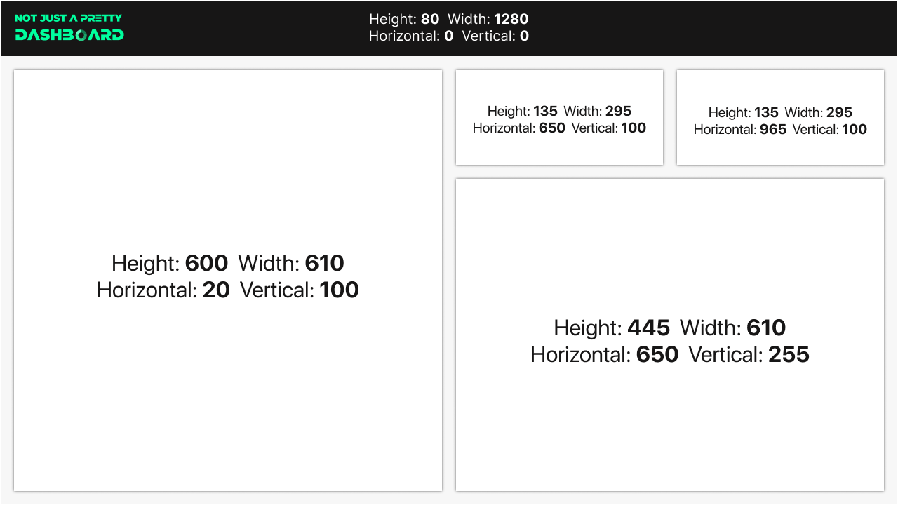
So to help, I've put together 20 of my favourite Power BI Layouts, each with the exact Height, Width, Horizontal & Vertical attributes so you can easily replicate them, without doing all the maths!
They are designed for the default page size (1280px x 720px) with a consistent 20px gap between everything, enough white space to keep everything looking sharp and organised.
Enjoy!
