Customisable SVG Pill Effect Using Measures
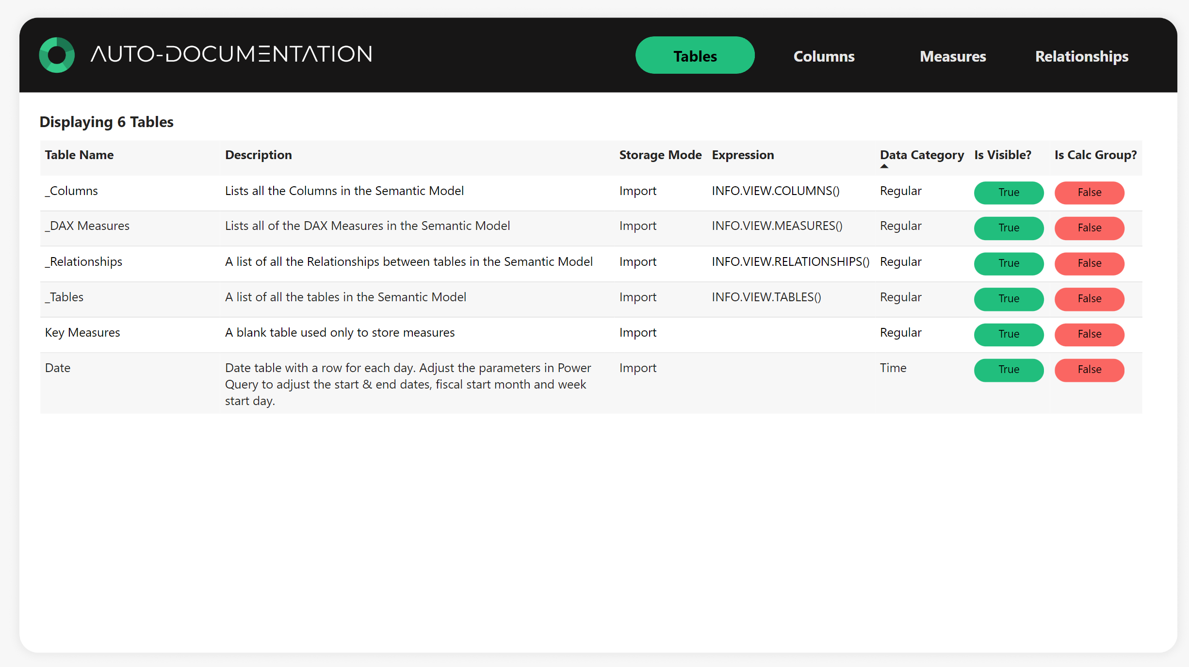
See how you can achieve this effect using DAX to create SVG Pill Buttons. I give you customisable code to create any style you want!
Intro
Tables in Power BI can sometime be a bit boring if they are just a wall of text. Sure, we can add some conditional formatting such as icons and data bars, but our options are limited by default in Power BI.
I love the look of "pill buttons", basically rounded rectangles with text in them, used to denote something like a status or true/false field.
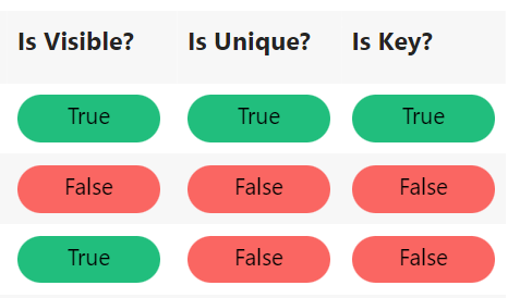
We can achieve this using some simple SVG code in a measure, then use that in a table to achieve the desired effect, such as below:

How It Works
Create a Measure for Each SVG Pill
I like to separate each pill into it's own measure for reusability in the future. For example, a "True" pill could be re-used multiple times in a report, for different purposes.
In my Auto Documentation report, my SVG Icon measures look like this:
![]()
Here's the code for the True & False pills. Notice I have created variables to control all aspects of the SVG, which we can customise to our liking. In this case, all I am going to change between the True & False pills are the DisplayText and FillColour variables.
True Pill =
VAR _Width = "150"
VAR _Height = "50"
VAR _FillColour = "#00BF77"
VAR _TextColour = "#000000"
VAR _DisplayText = "True"
VAR _FontStyle = "Segoe UI"
VAR _FontSize = "24"

RETURN
"data:image/svg+xml;utf8, <svg width='" & _Width & "' height='" & _Height & "' xmlns='http://www.w3.org/2000/svg'>
  <rect width='" & _Width & "' height='" & _Height & "' rx='25' ry='25' fill='" & _FillColour & "' />
  <text x='50%' y='50%' fill='" & _TextColour & "' font-family='" & _FontStyle & "' font-size='" & _FontSize & "' dominant-baseline='middle' text-anchor='middle'>"& _DisplayText &"</text>
</svg>"
False Pill =

VAR _Width = "150"
VAR _Height = "50"
VAR _FillColour = "#FD625E"
VAR _TextColour = "#000000"
VAR _DisplayText = "False"
VAR _FontStyle = "Segoe UI"
VAR _FontSize = "24"

RETURN
"data:image/svg+xml;utf8, <svg width='" & _Width & "' height='" & _Height & "' xmlns='http://www.w3.org/2000/svg'>
  <rect width='" & _Width & "' height='" & _Height & "' rx='25' ry='25' fill='" & _FillColour & "' />
  <text x='50%' y='50%' fill='" & _TextColour & "' font-family='" & _FontStyle & "' font-size='" & _FontSize & "' dominant-baseline='middle' text-anchor='middle'>"& _DisplayText &"</text>
</svg>"
Create Measures to Reference the SVG Pill Measures
Now we have our base SVG Pill measures, we want to use them.
I'll use the "Column Is Key" example. I want to show the true pill if the column is marked as a key, false pill if not. So I use the following measure:
Column Is Key Icon = IF(
    SELECTEDVALUE( _Columns[Is Key?] ) = TRUE( ),
    [True Pill],
    [False Pill]
)
Set the Data Category
Once the measure has been create, be sure to set the Data Category to "Image URL". If you don't do this, you will see the actual code when you use the measure in a table, not the image.

Set the Image Size on the Table Visual
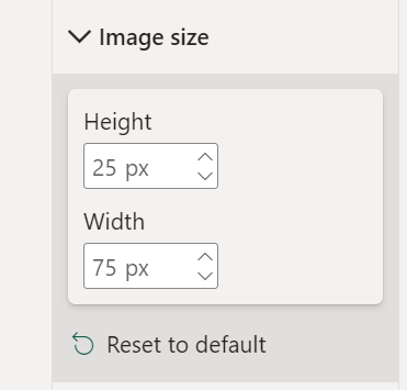
When you first drag the visual onto a table, the SVG images might not look quite right. have a play around with the Image Size options in the table to see what suits the SVG best. I found the 25px x 75px worked best for this example.

Also, increase the "Row Padding" option under the "Grid" setting. This gives the table rows some space to breath and makes sure the SVG's are not touching or bunched together.
Basque in the Glory of Your Swanky New Table
There you have it, a shiny new table to show of to your end users. Have a play around with the customisable options and see what you can create!

If you want to see these in action, check out my Auto Documentation Template Free Download to get your hands on the PBIX file!

