Hotel Bookings Report

Hotel Bookings Report
My entry to the Onyx Data July 2023 challenge, which made it as one of the top 3 finalists
Open in Power BIBackground
This was my first attempt at a Power BI challenge that I kept seeing on LinkedIn. I realised that all the work I've done in the past for clients, I couldn't show off as they were obviously confidential, so I wanted to start to build a portfolio for myself. What better way than by taking part in a challenge? Two birds, one stone.
This report ended up getting into the final 3 of the NovyPro sub-contest and had a lot of love on LinkedIn, which I was more than happy with for my first contest.
Thought Process
I wanted to try some advanced techniques in this report. The first being a custom collapsible filter pane, with a lightbox effect (more on that in a sec).
The second was attempting to build a carousel that you normally see on websites, where the user can scroll through different slides. I've never seen that done in Power BI before so I wanted to see if I could replicate it (spoiler alert, I could).
The other thing I wanted from this report was to brand it as if it were a real client and I was working from the brand guidelines. So, the branding is heavily influenced by TUI, although I've done an Aldi and tweaked it slightly to avoid using their name.
Features Used
Collapsible Filter Pane
I wanted to create an easy to use filter pane that was hidden from view when not needed.
Borrowing a common technique used in web design, I added a lightbox effect that obscures the rest of the page with a transparent black effect, focusing the users attention directly on the filter pane. The user can then click the X or anywhere on the page, outside of the filter pane, to close it.
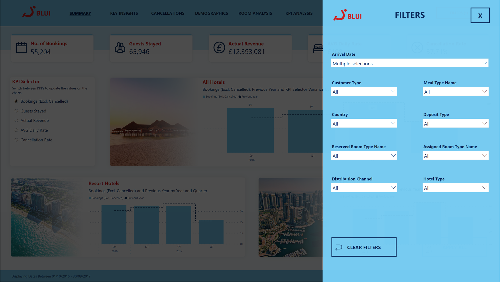
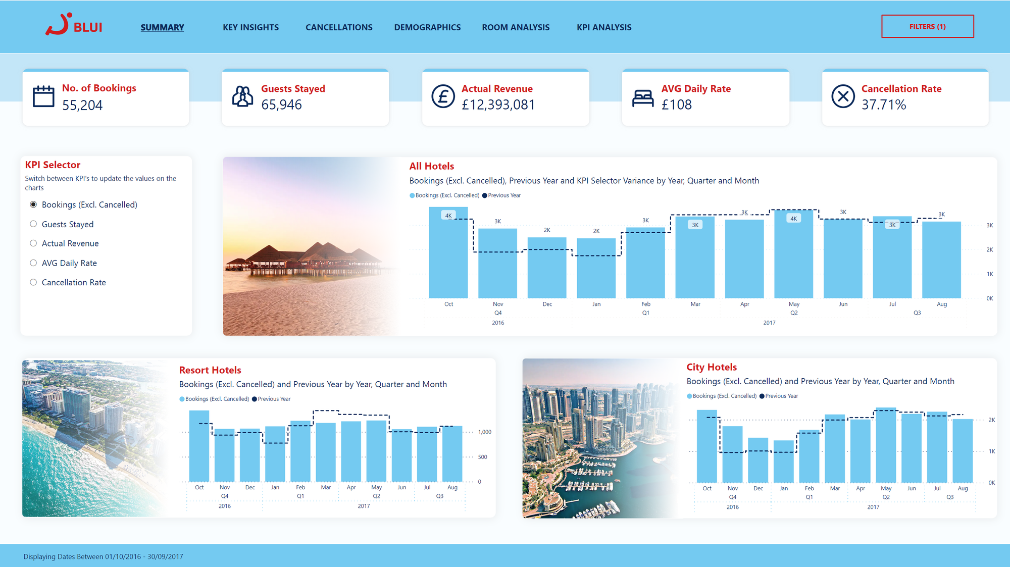
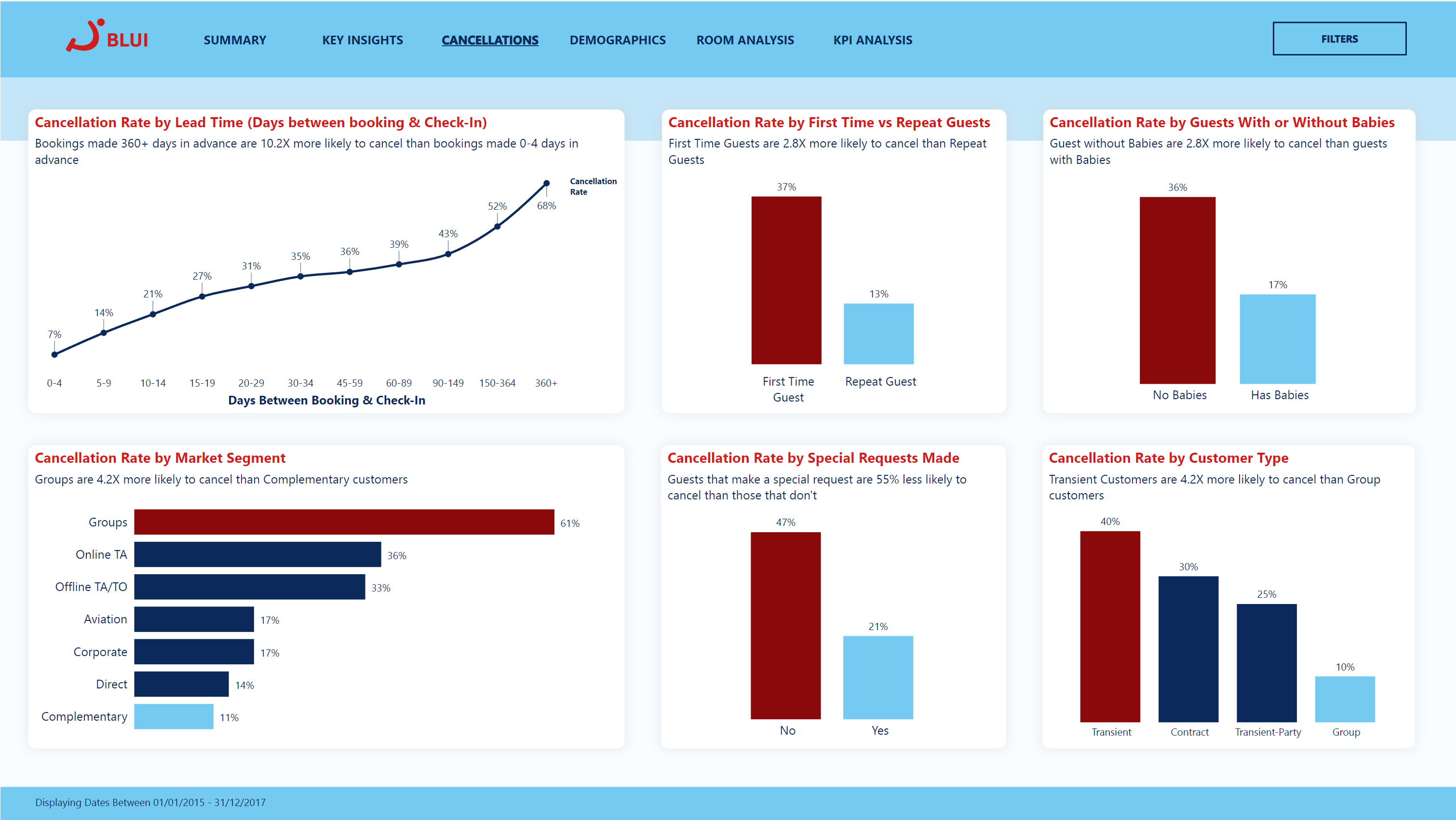
A nice little touch that might go unnoticed to the untrained eye, is the dynamic filter button that displays the number of filters that are currently set. Along with dynamically changing colour when any filters are set.

Carousel Effect
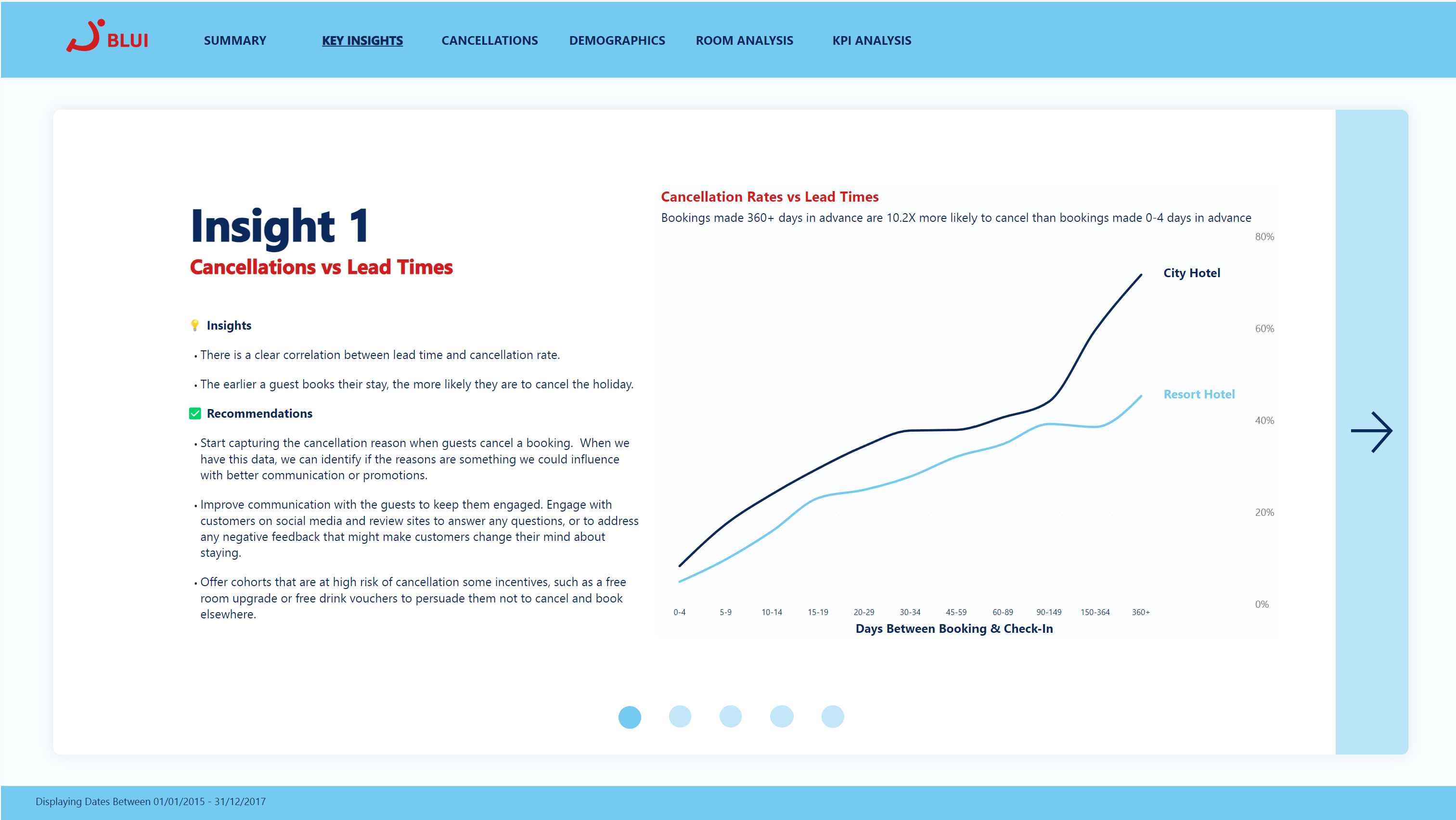
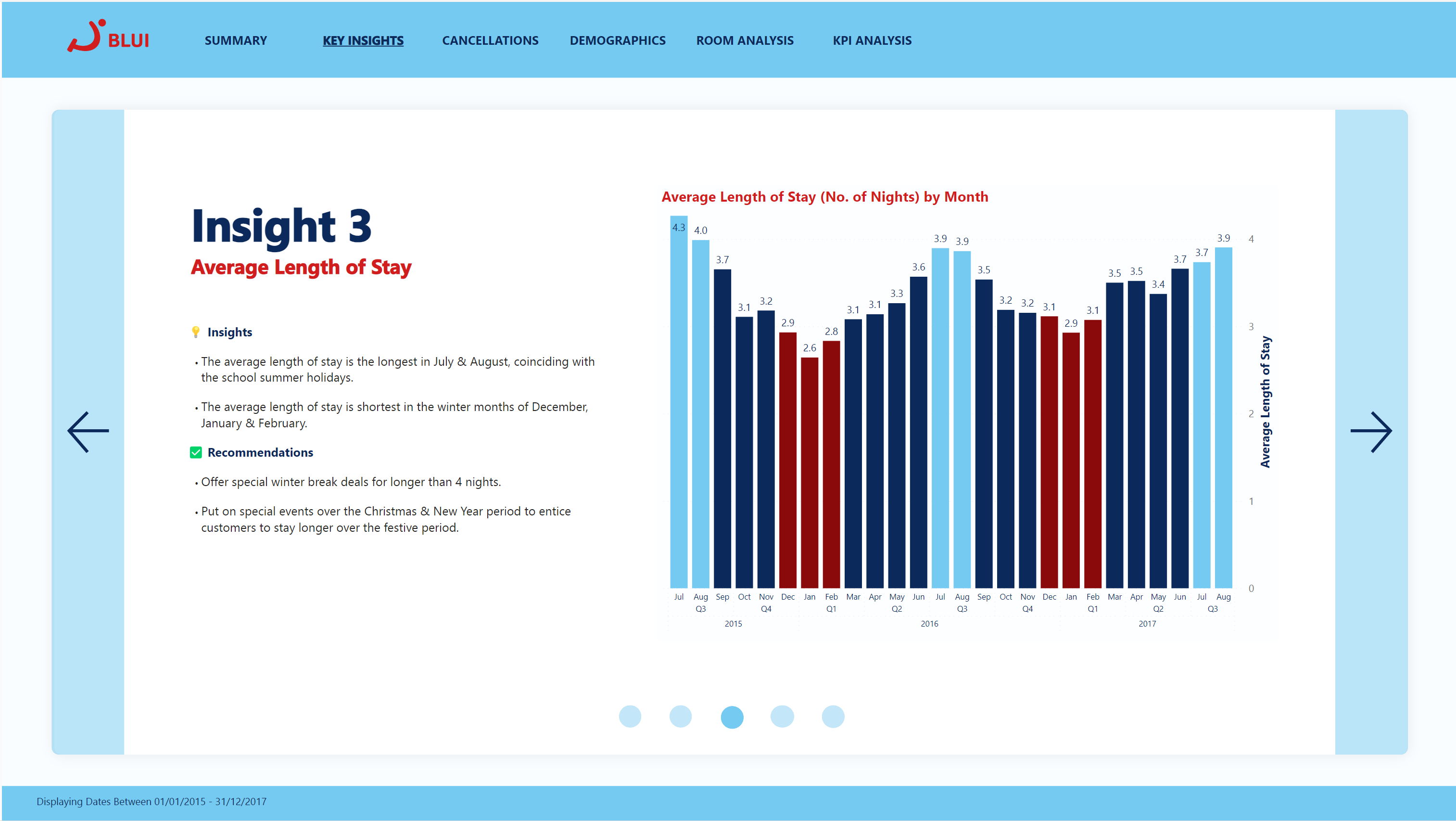
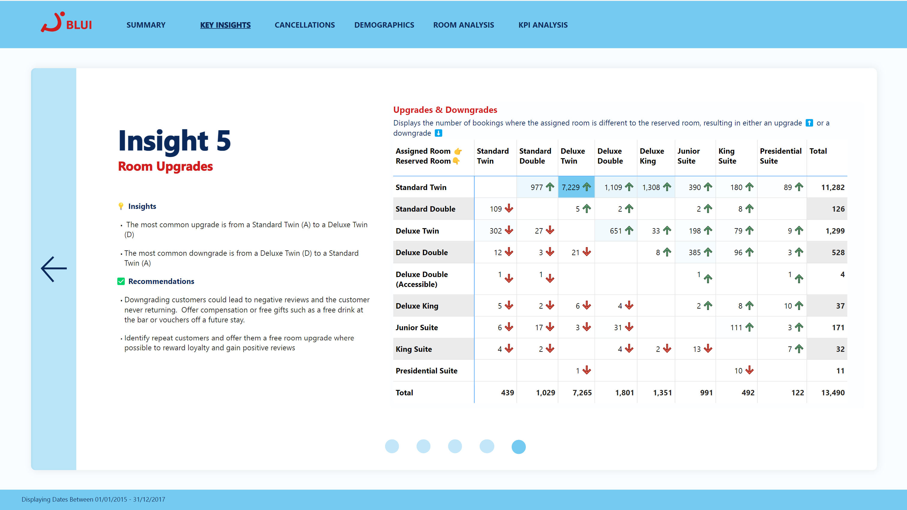
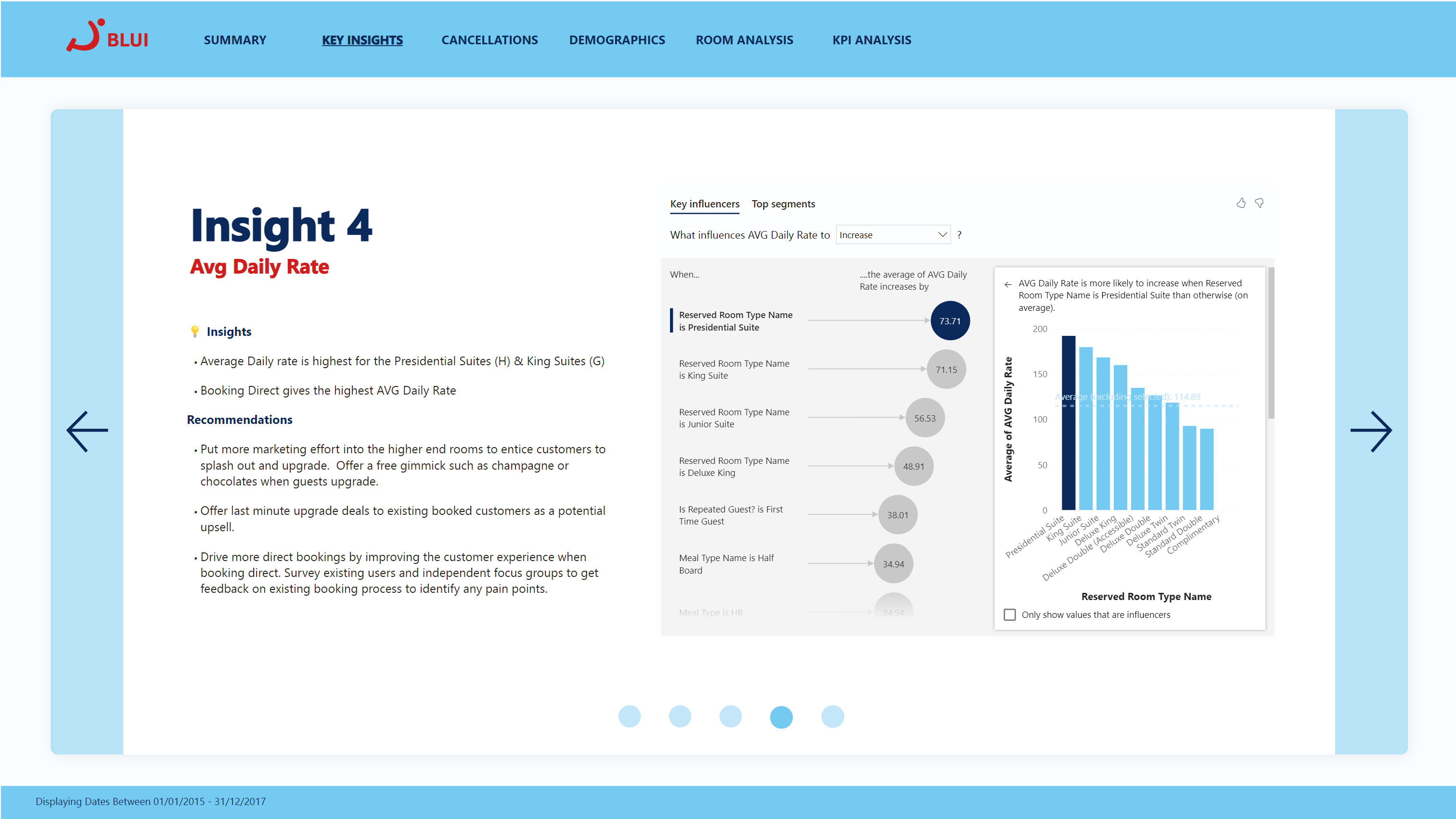
It's really common on news sites, or on home pages of websites, to have a horizontally scrolling paginated carousel, allowing the user to click through each slide easily.
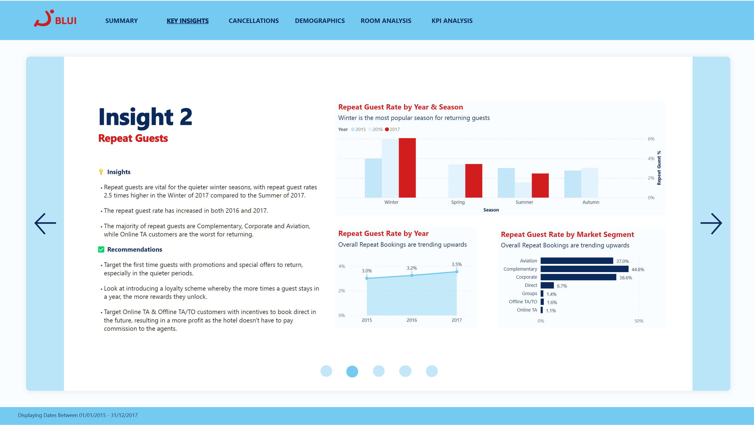
This is what I aimed to replicate, and I beleive, managed to pull off. With buttons either side of each slide to go back & forth, as well as circle icons on the bottom to let the user know their location in the slide deck, the result is really effective.
In this use case, it is used to flick between 5 insights from the dataset. This would be great as an interactive presentation if you were presenting to the board for example.
Field Parameters
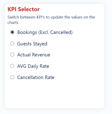
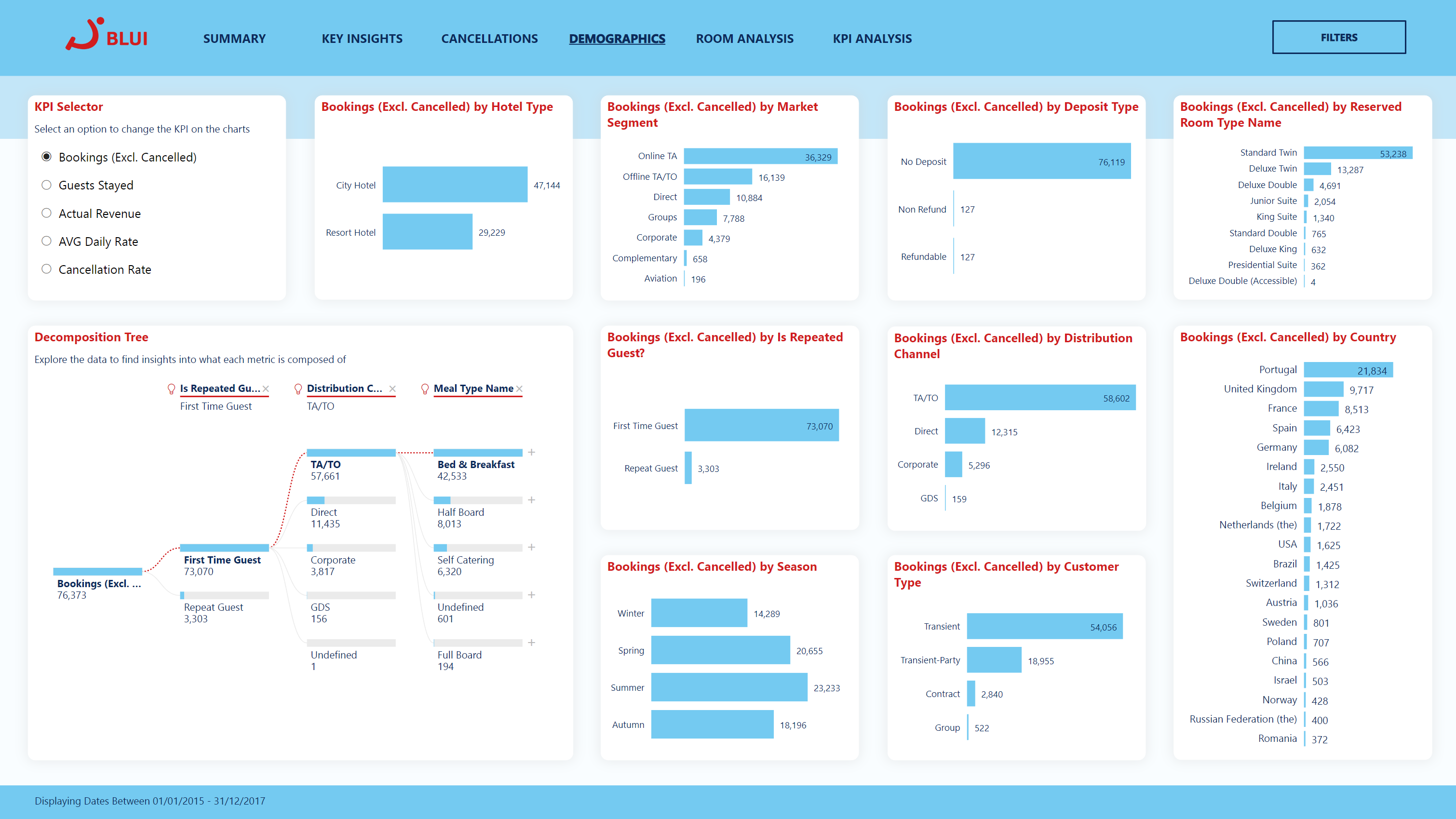
Field parameters are used on the homepage as a "KPI Selector", alowing the end user to quickly switch between different key metrics, without changing pages. This allows one page to be used for multiple different use cases, keeping things simple and easy to use, as well as keeping loading times to a minimum.
