How to Style Your Power BI Reports to Match the App Theme Colours
Wondering what your options are for theme colours when creating a Power BI App? We are currently limited to 22 choices, so see how they all look in real life to see which you like best
Let's talk about Power BI App design. I love using apps, the built-in navigation is great, it gives us lots of flexibility and it's the recommended way to package and share reports internally & externally.
But, when it comes to choosing the App Theme Colour, we're restricted to only the default 22 colours that Power BI gives us.
Maybe one day we'll get the ability to choose custom colours to match our report theme, but for now we've got to make do.
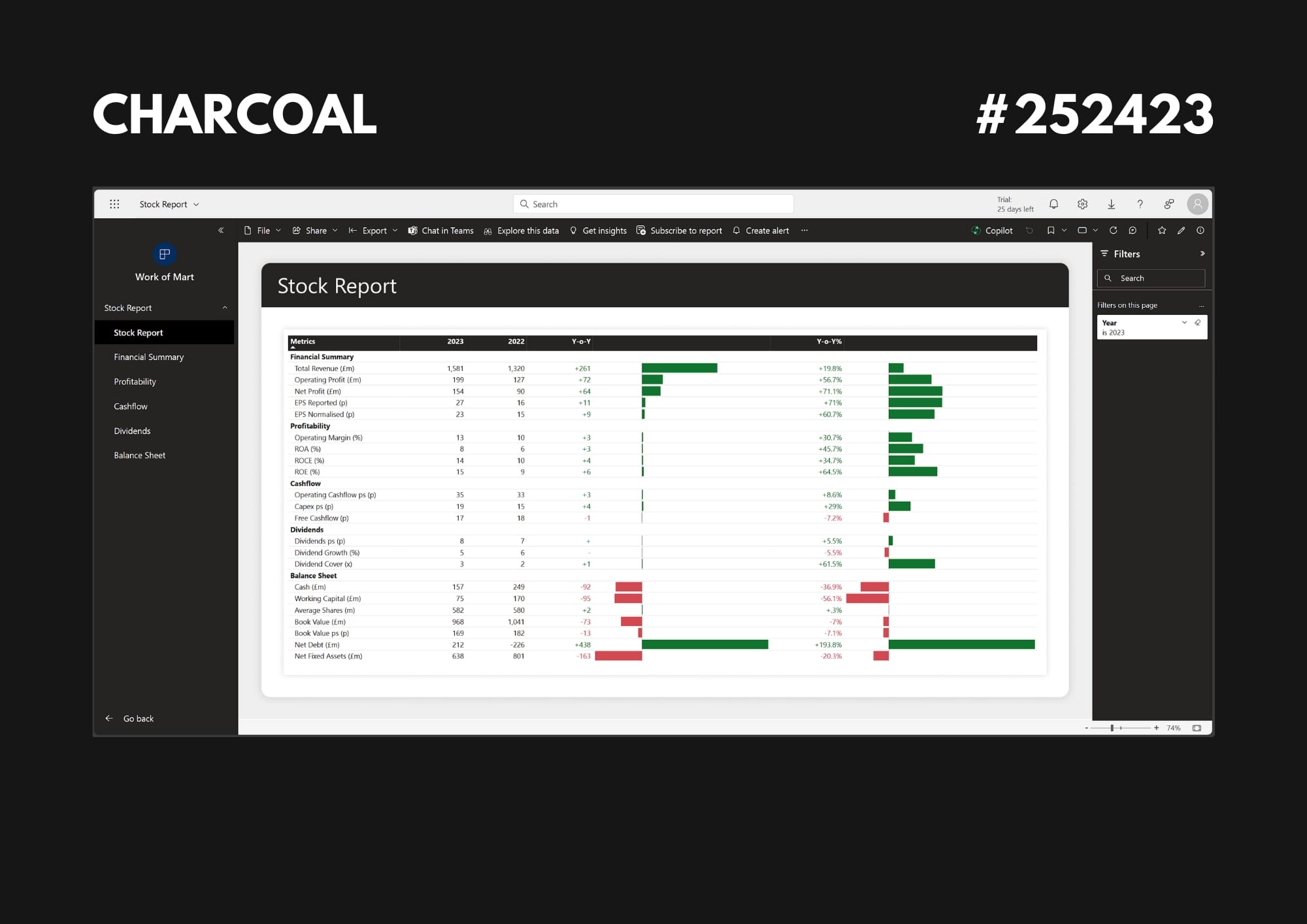
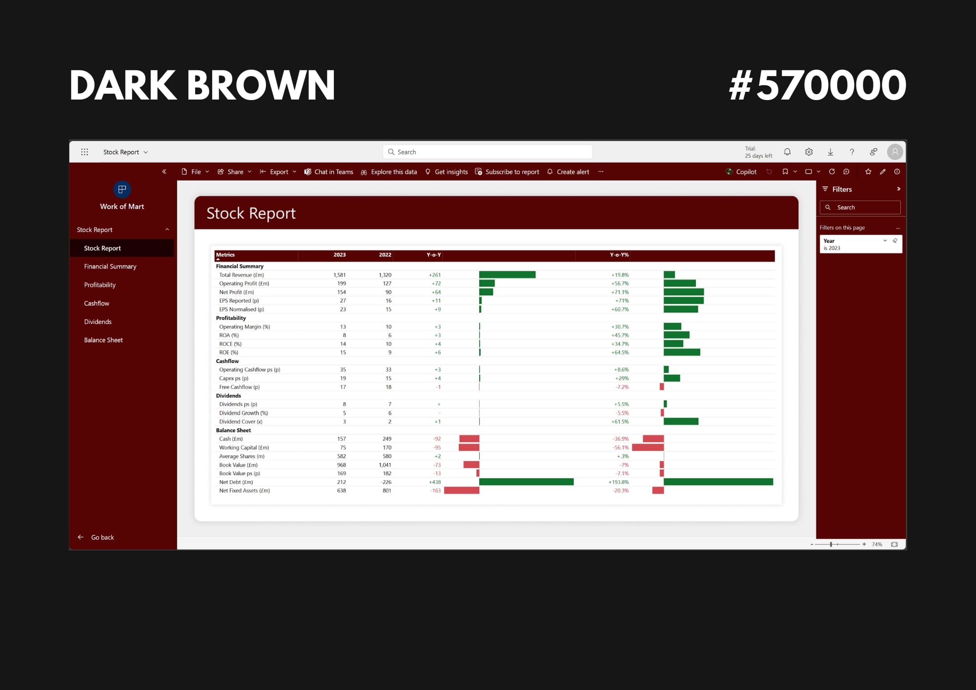
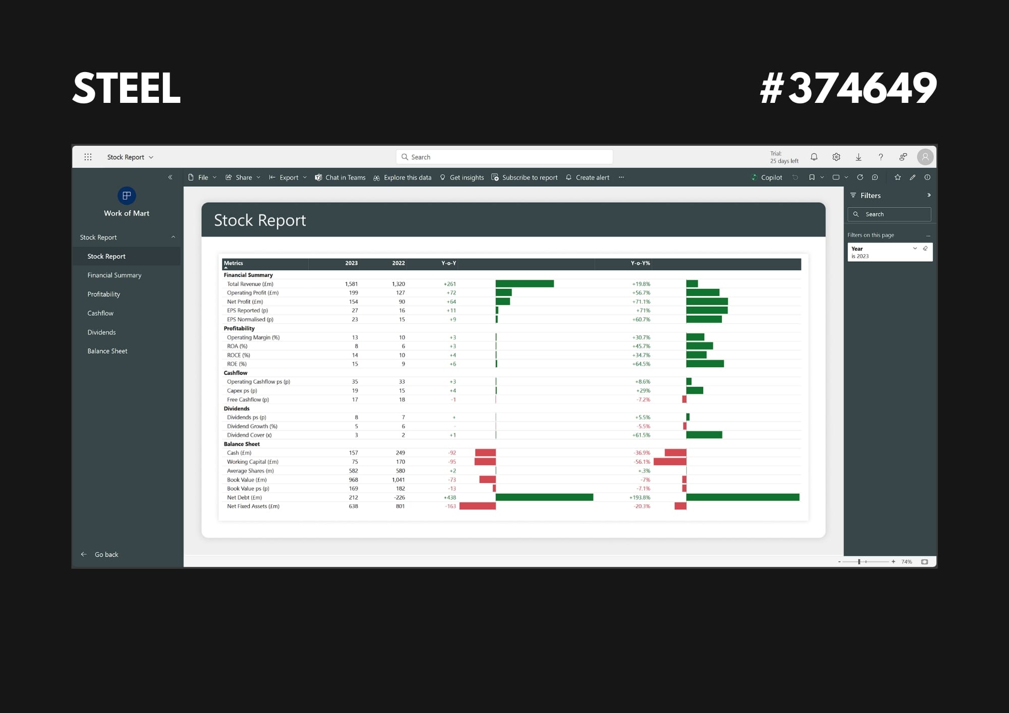
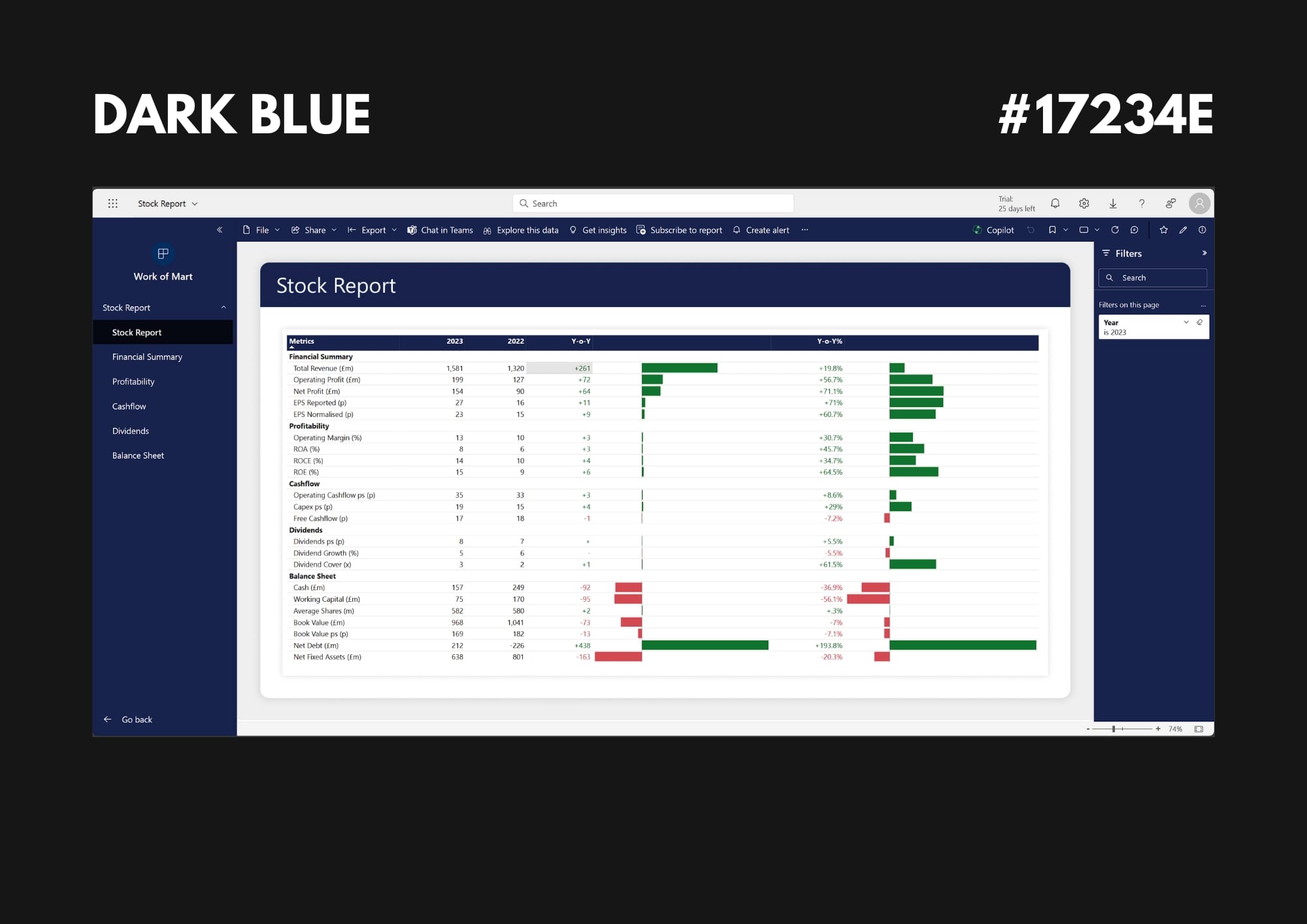
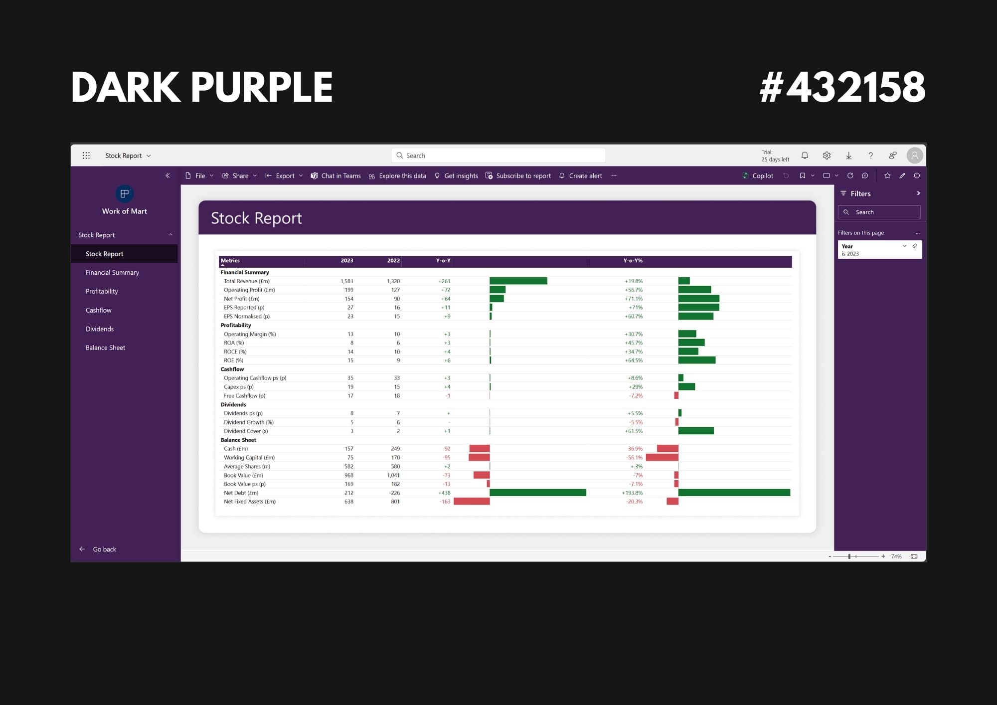
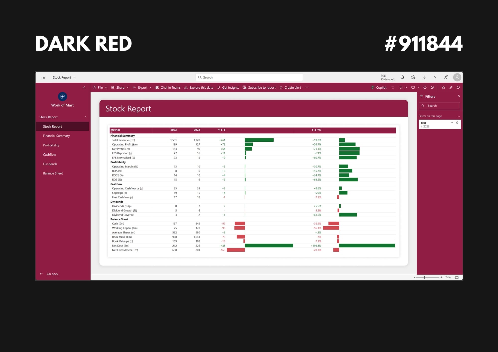
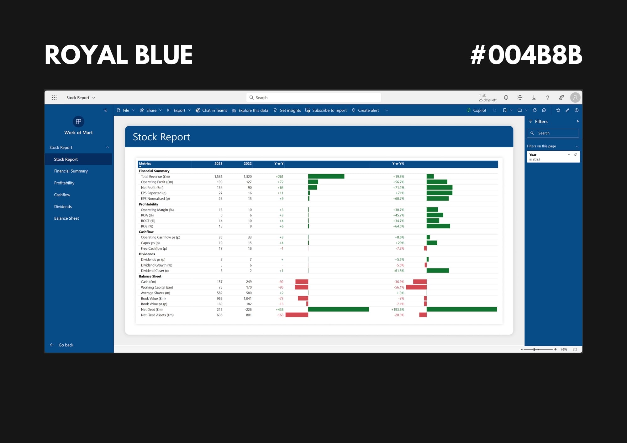
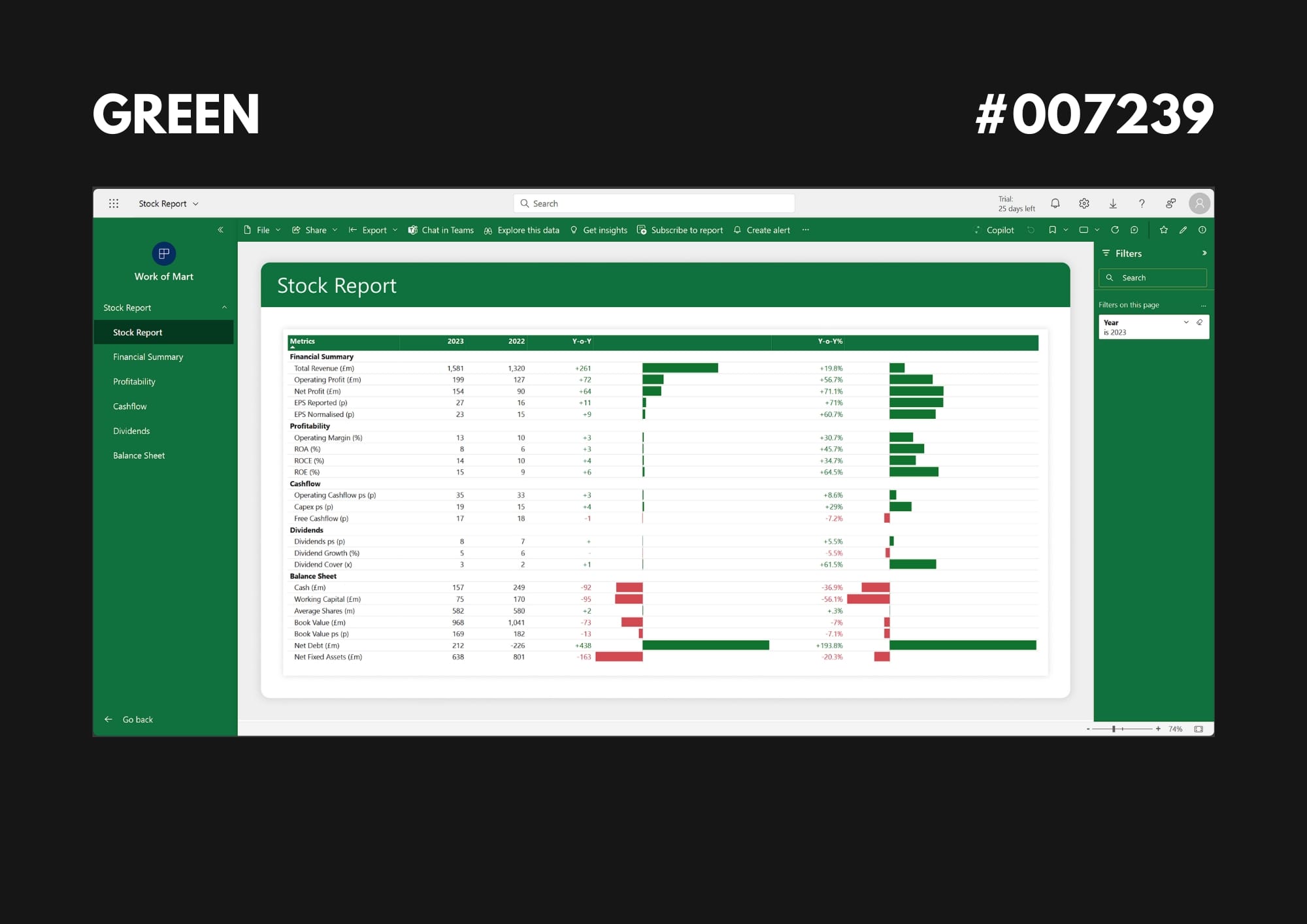
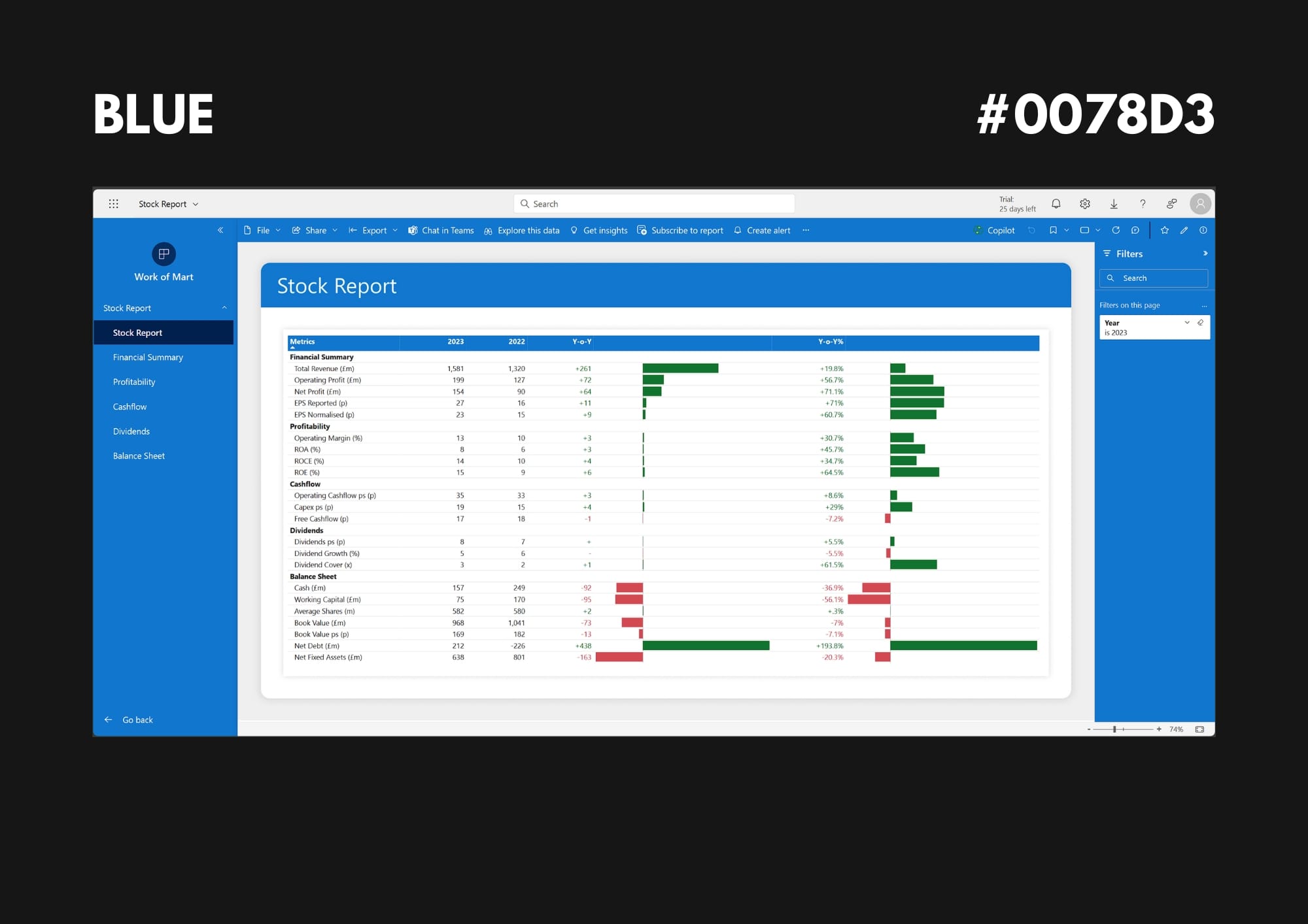
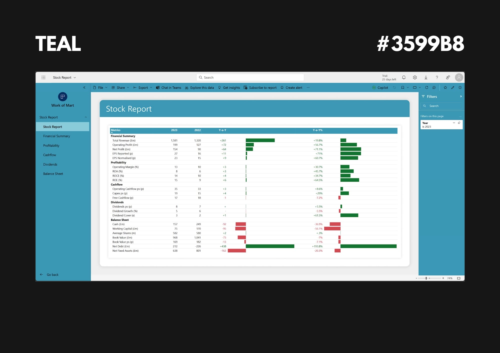
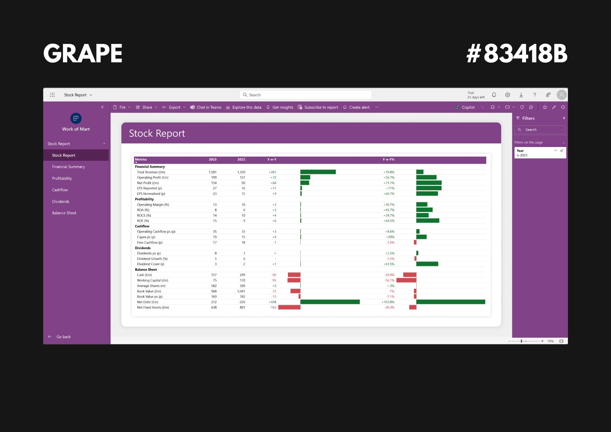
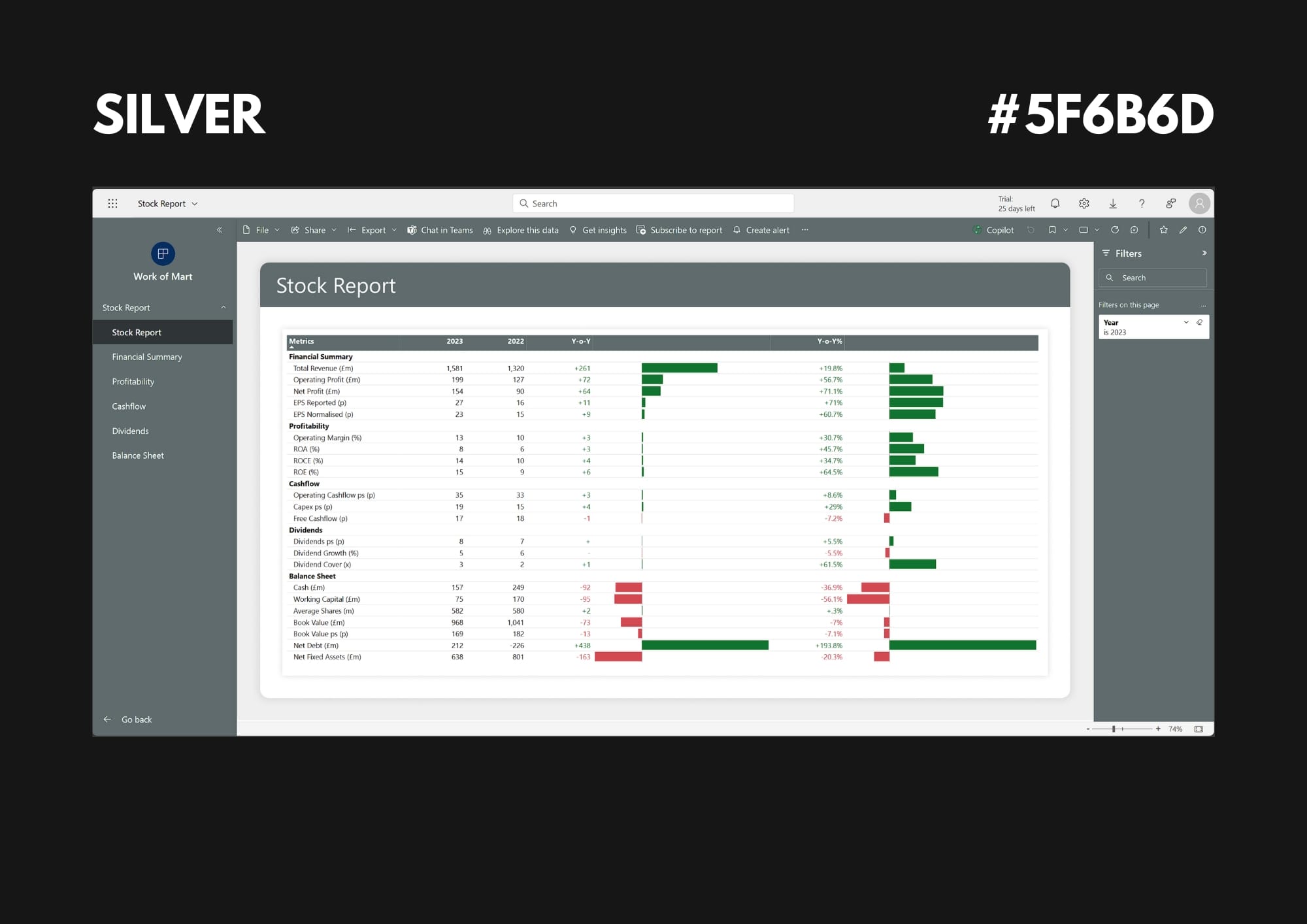
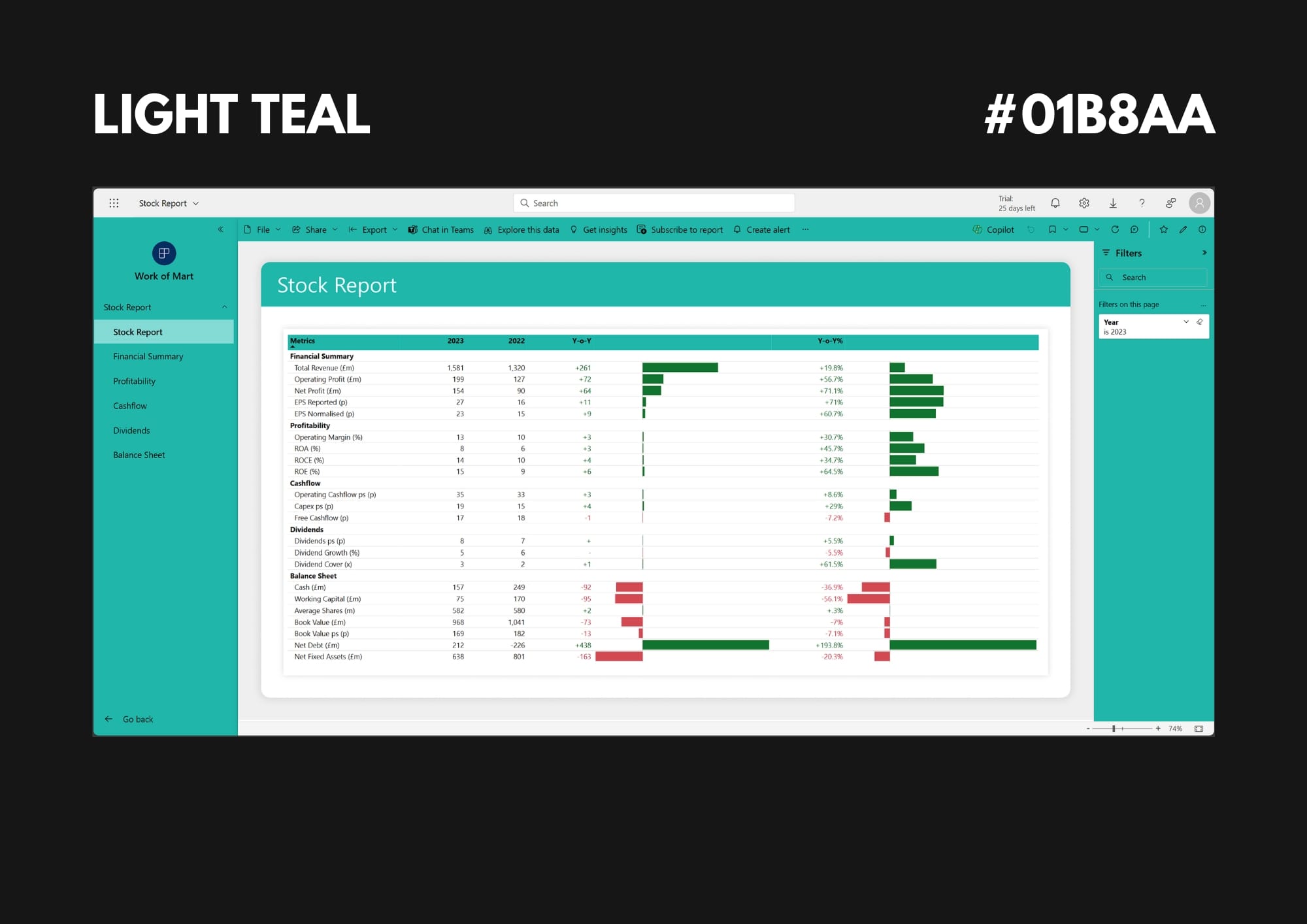
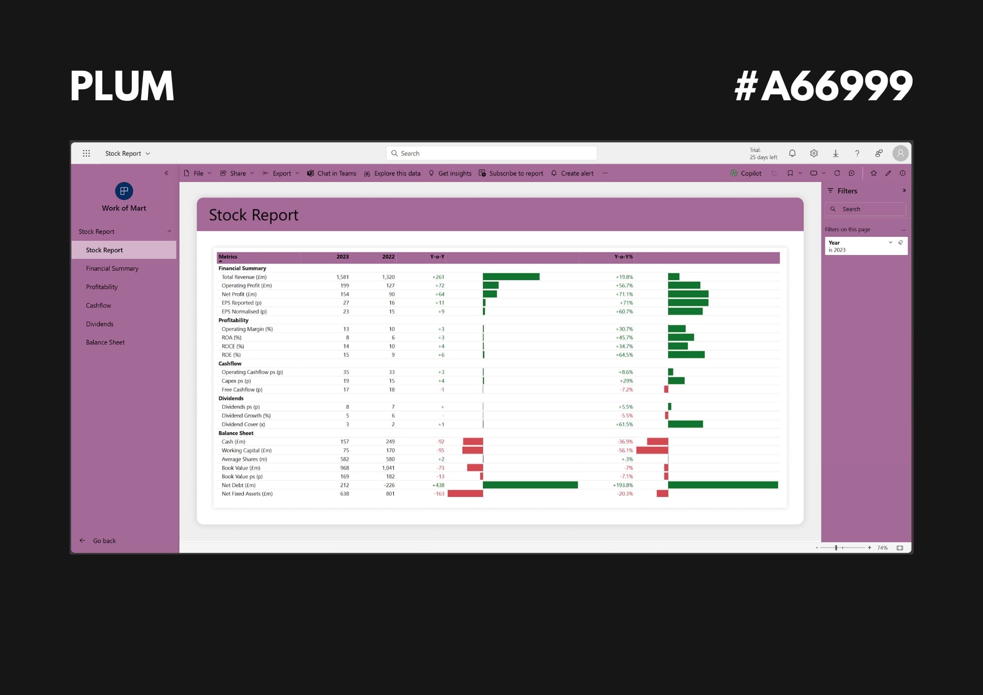
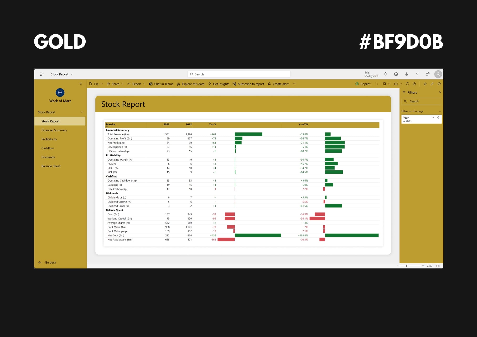
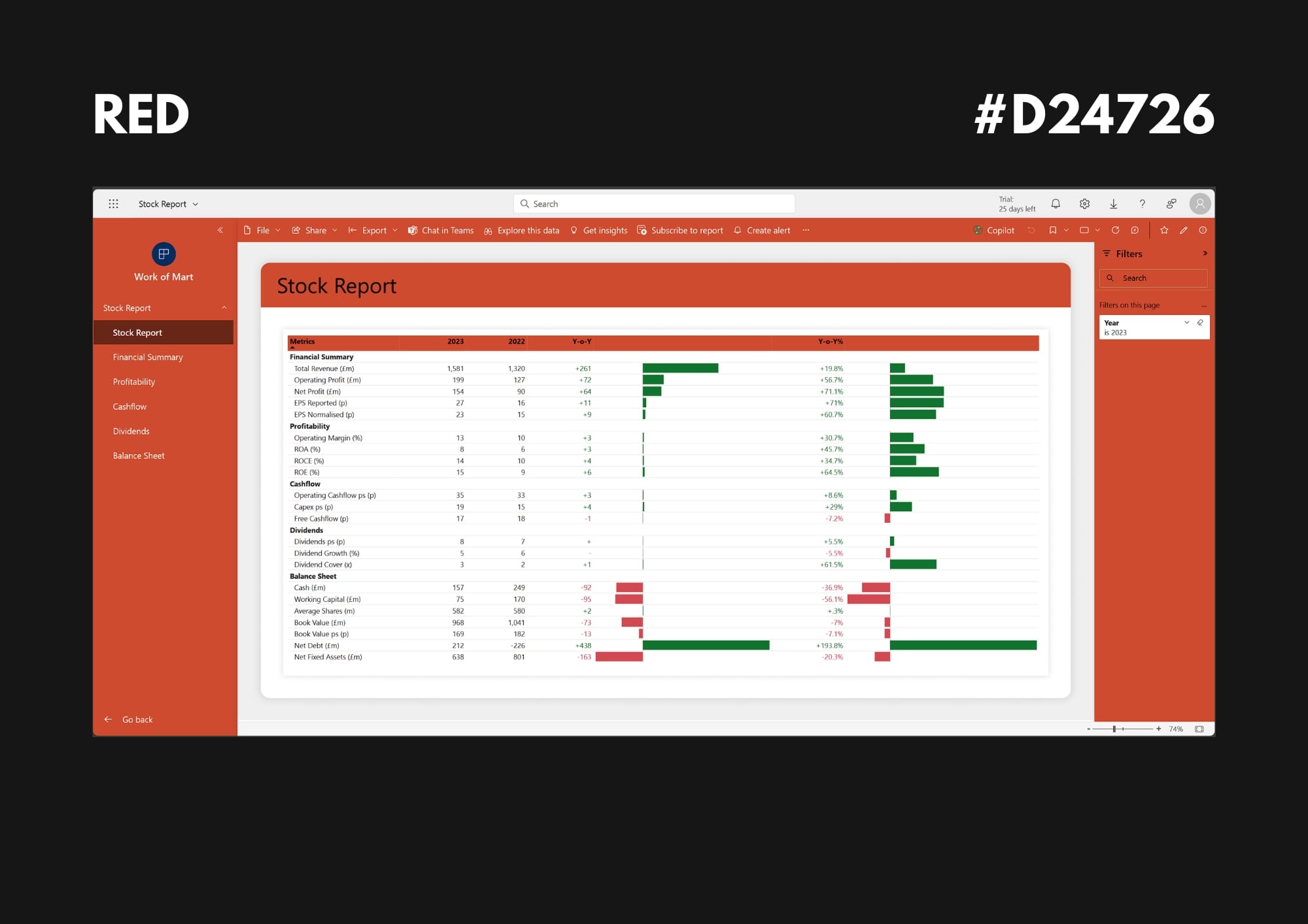
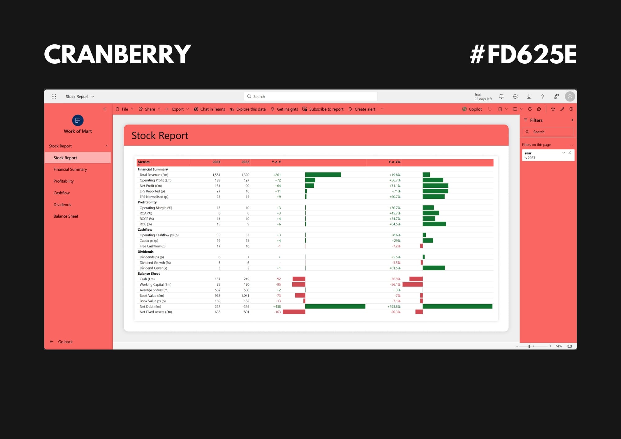
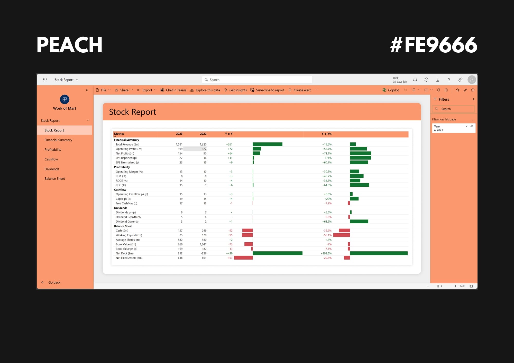
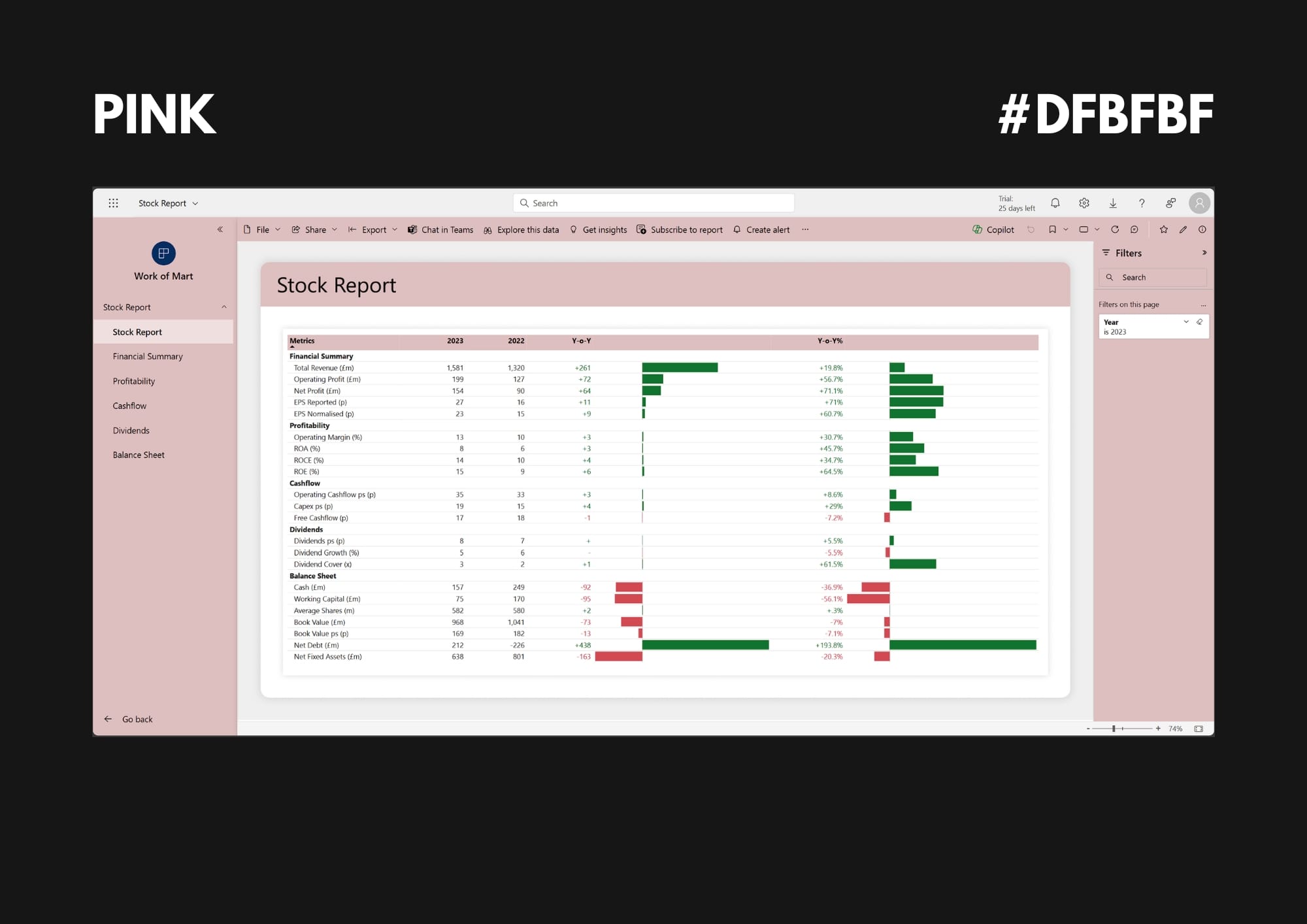
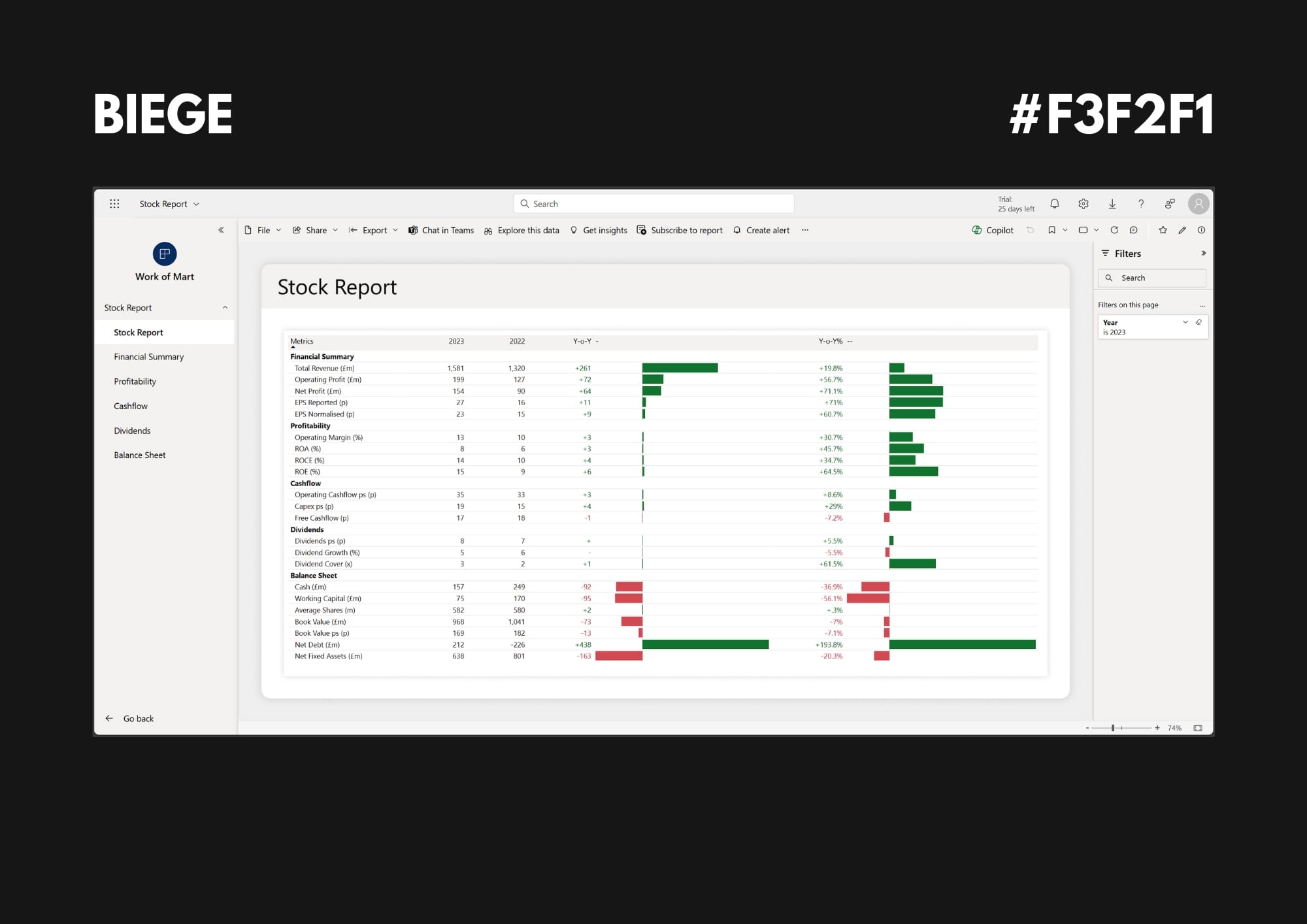
So, I thought I'd share with you examples of what each app colour looks like in real life to give you some inspiration.
One trick I like to use with apps, is to match the filter pane background to the app theme colour.
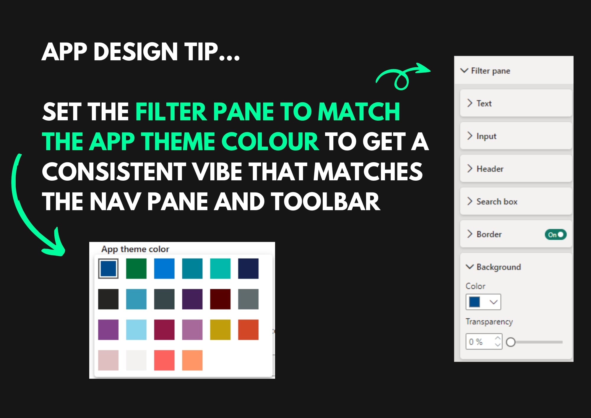
Personally, I think it looks really cool when the filter pane matches the nav pane and toolbar. It makes it look all integrated and seamless.
You can find the Hex codes on each example so you can try it for yourself. Just take the hex code and set the filter pane background of your report to match.
