IT Support Desk Dashboard

Background
After the excitement of coming in the top 3 of the Hotel Dataset Challenge the previous month, I wanted to jump straight into another challenge, so this time I tried the FP20 Analytics challenge based on an IT Support Desk.
Way back in the day as an early twenty-something, my career started out as an IT Support Engineer, then later as a Dynamics 365 consultant I worked a lot with case management software, so I already had some insight into the type of data I would be working with.
Thought Process
Don't know why, but I wanted to go dark on this one. It's not often that you get to apply a dark theme on a really clients' report, so I wanted to give it a go. I took inspiration from Google's Material Design principles regarding dark themes and was happy with the result.
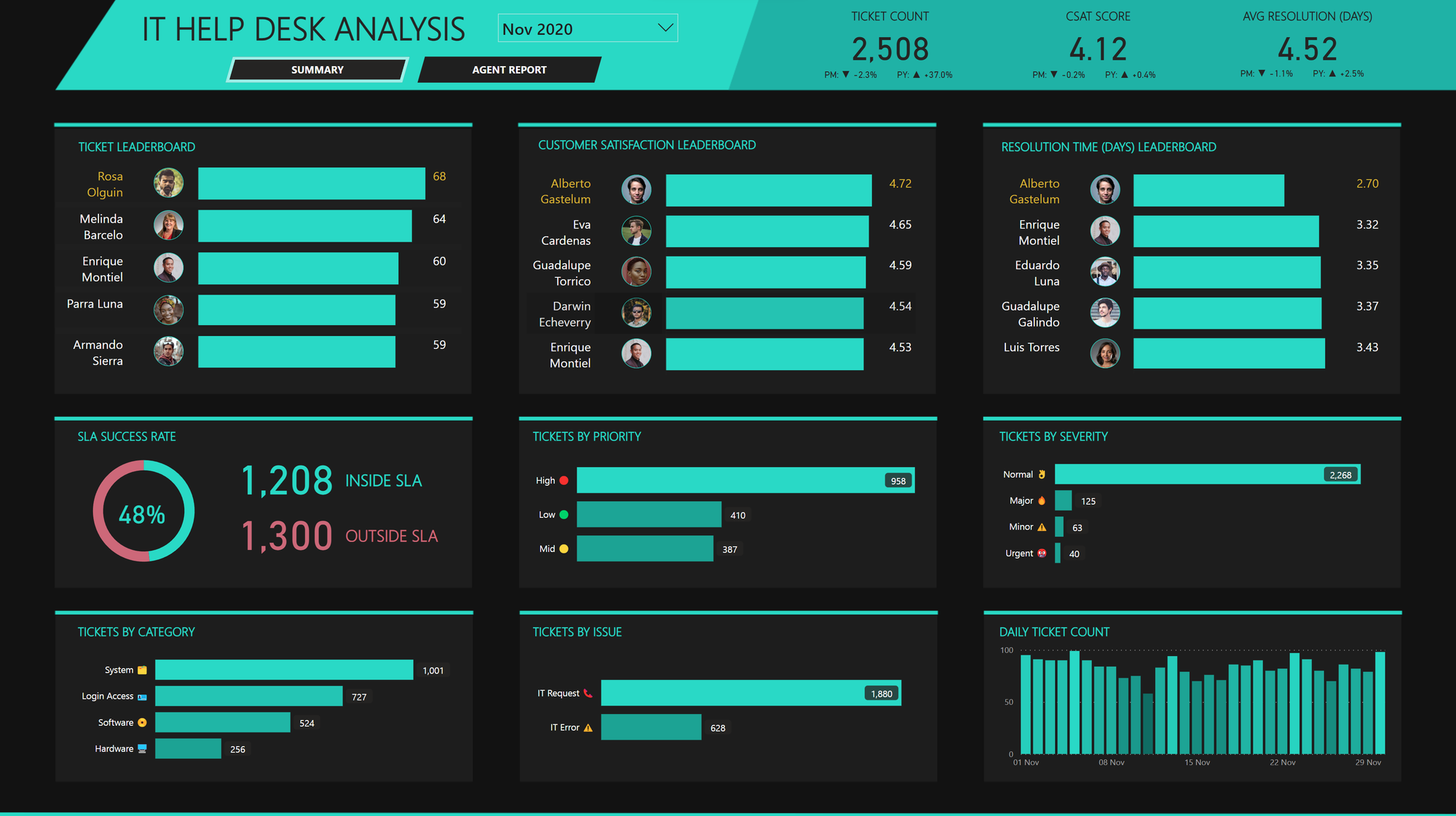
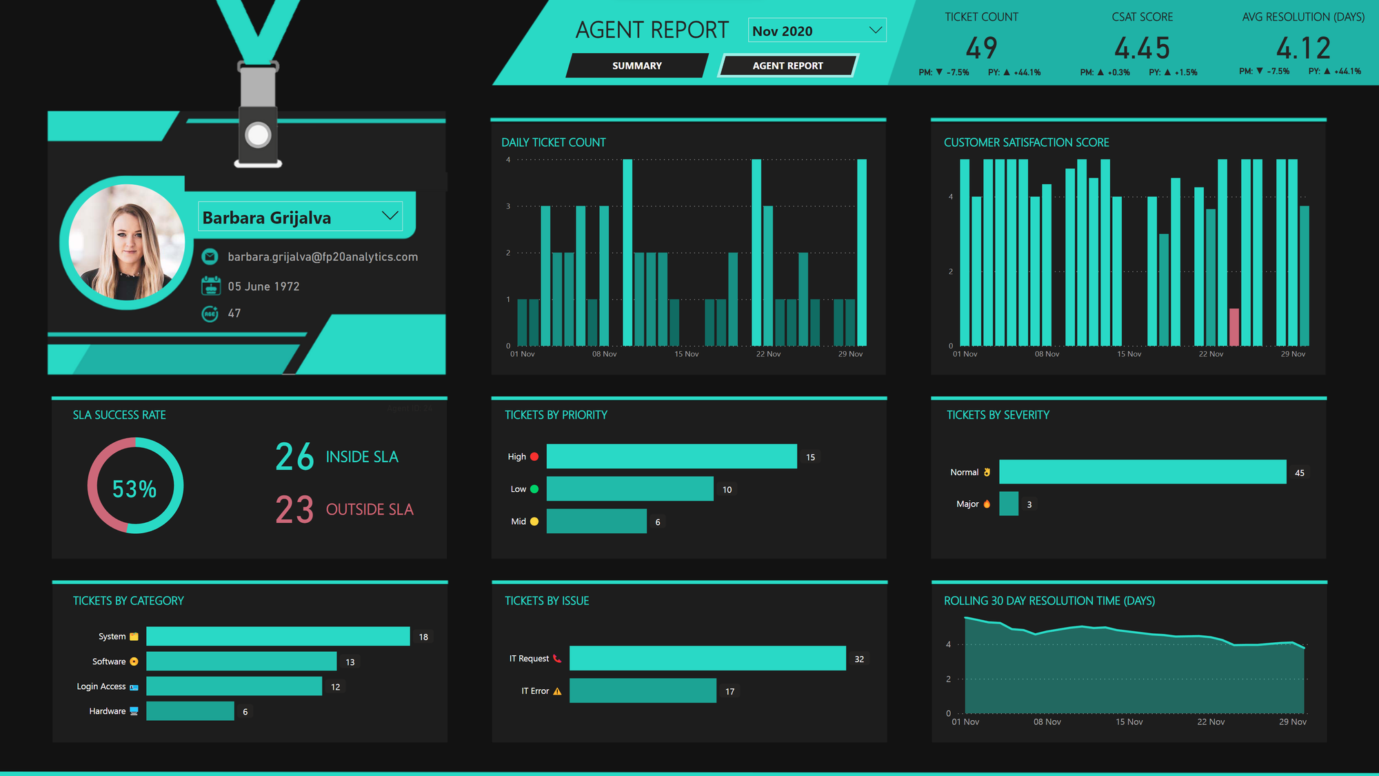
The report would be in 2 pages. One for a top level summary, the other for a detailed look at an agents' performance. This could be used for managers to perform 1-on-1's for example.
Features Used
Leaderboards
Nothing like a bit of friendly competition between support agents! There are 3 leaderboards on the page, ranking agents by number of tickets, customer satisfaction and resolution time per month.
The top performing agent for each leaderboard is highlighted in yellow. The leaderboards also have the profile pics of each agent which I thought is a nice touch. You could imagine this dashboard on a big screen of the support center office!
These are all done using the native table visual, with data bars and image URLS.

Emojis
Just to add a bit of extra something to the bar charts, I've added emoji's to the y-axis categories.

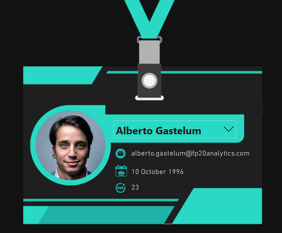
Lanyard Visual
Now this one is a bit out there, but it's for a competition not a real client, so why not, right? 🤷
As we are focusing on a specific agent, the visual displays the agents profile pic, email date of birth and age as if it were their lanyard.
Completely pointless and would never be used in the real world? Yes. Was it fun to create? Also yes.


