Marketing Campaign Dashboard

Marketing Campaign Dashboard
Shortlisted as a finalist for the Data2Speak Data Visualization Award 2024
Open in Power BIBackground
This was an exciting one for me. I saw an advert on LinkedIn for the Data2Speak Data Visualization Awards and it piqued my interest.
The competition was being judged by some big industry leaders that I've got massive respect for, such as Marco Russo and Greg Low, two greats that I've learned a lot from over my career.
This stood out from previous challenges as I had the choice of multiple datasets to choose from, deciding in the end to go for a Marketing Campaign dataset for a ficticious global digital streaming platform. I called the fake company "Boothflix" and borrowed some brand guidelines from you know who.
My entry made it to the shortlist of finalists and I was invited to attend the award ceremony at the end of the Data2Speak conference.
Unfortunately I didn't win this time, but it was an honour to be recognised and I had a lot of positive feedback. I'll be back next year to try again!
Thought Process
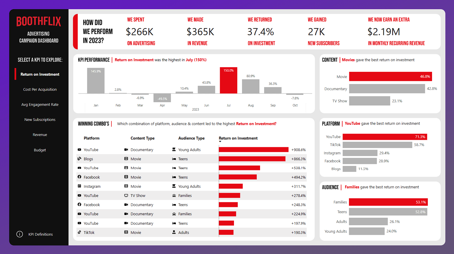
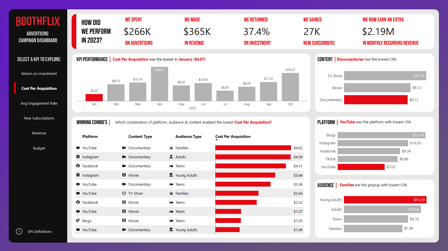
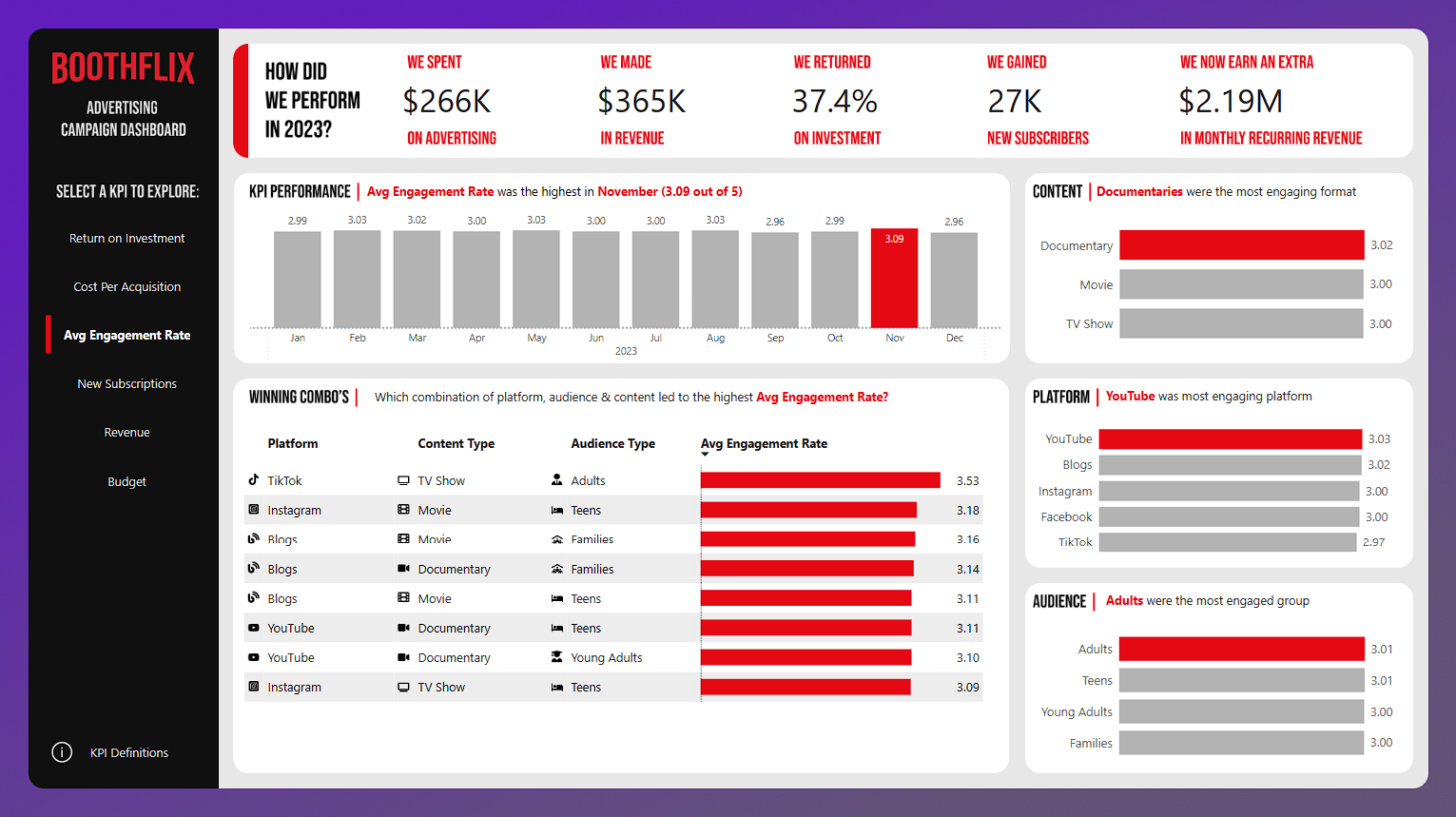
I wanted to go for a one page report that was simple, yet powerful. Using field parameters, the user can explore multiple KPI's on the one page.
I wanted to incorporate lots of plain English in the dashboard, that read more like full sentences rather than jargon and acronyms.
I've used colour to emphasise the standout data points, combined with the dynamic titles, it provides more of a storytelling experience.
Features Used
Figma Background
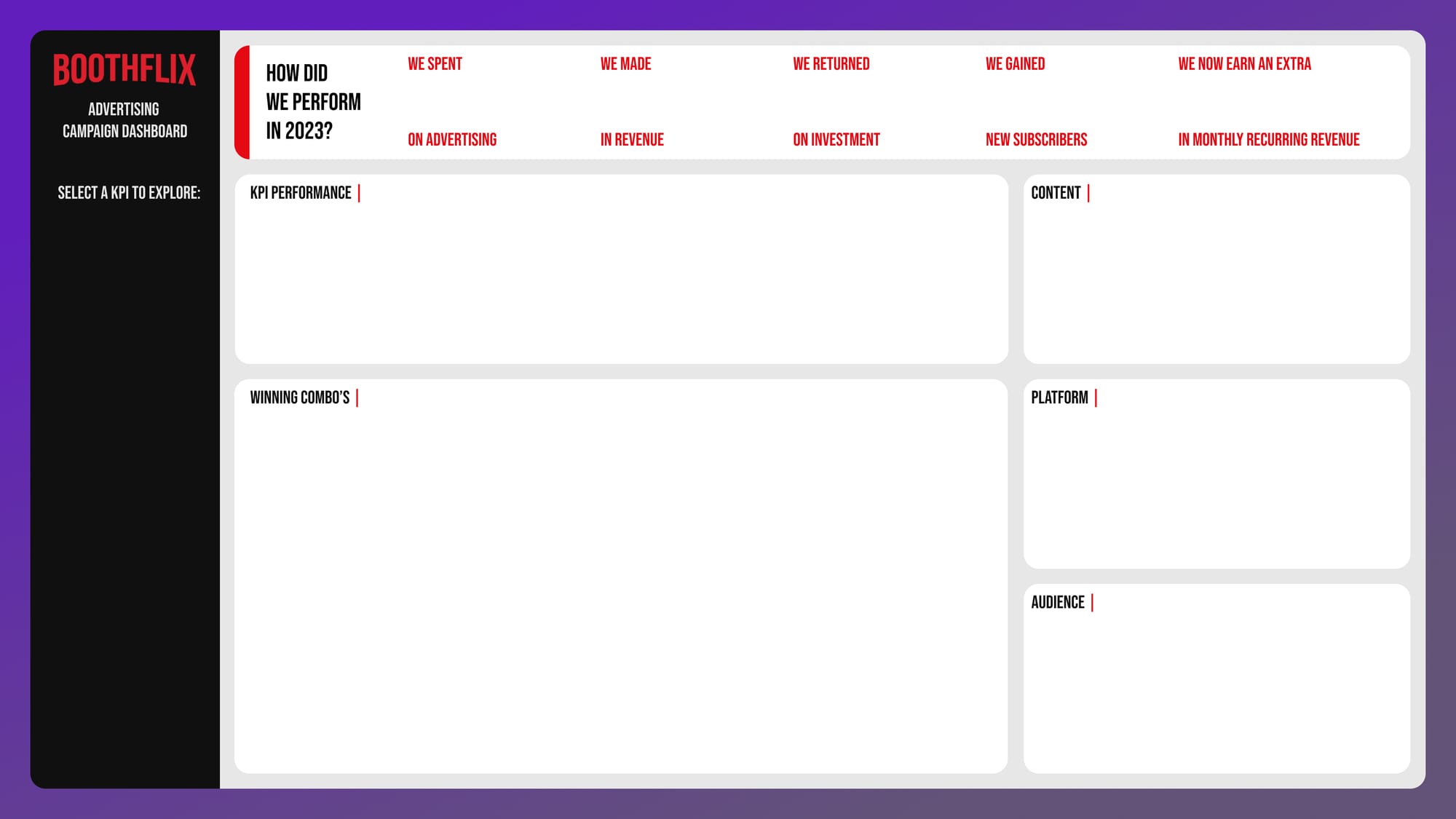
The background was designed in Figma, reducing the number of elements on the page and allowing me to use custom fonts and effects.
Pop Up Definitions Screen
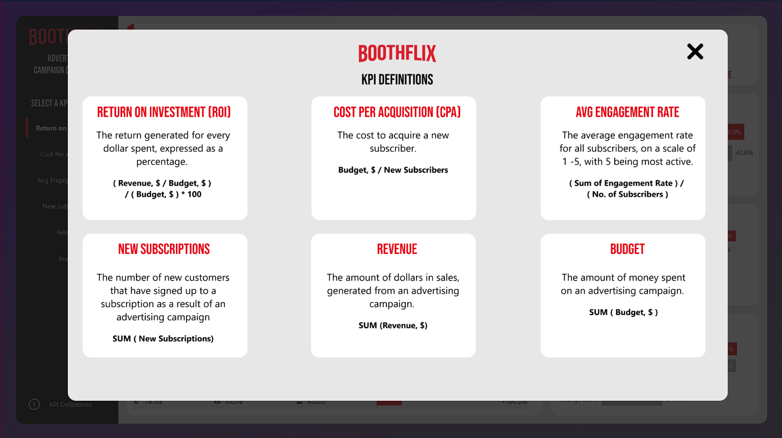
Users may not always know what a certain metric means, or how it's calculated, so I've created a pop-up screen to counter that.
When the user clicks on KPI Definitions, a pop-up appears with a definition and formula for how each KPI is calculated.
The pop-up has a lighbox effect that can be minimised by clicking the X or outside of the popup, similar to the custom filter pane I used on my Hotel Dataset Report.
URL image icons in tables
To make the tables more interesting and intuitive, I used custom icons hosted in OneDrive, and used the image URL to load them into the native Power BI table visual. Combined with data bars, the finished result looks great.
![]()
Dynamic titles & Conditional Formatting
I wanted the titles to tell a story, no matter what the usr has selected. So I crafted DAX measures designed to tell the user which month was the highest/lowest for the selected metric, along with the actual value.
Combined with the conditional formatting on the chart that highlights the data point in question, the user hasn't got to think much on their own to get to the insights, I'm drawing their attention exactly to where I want them to be looking at.

Field Parameters & New Slicer Visual
The left navigation pane is actually a combination of the New Slicer visual and field paramaters to change the measres being displayed on the page. Using this method ensures rapid loading times and a seamless transistion when changing between metrics.

