Mastering "Theme First Design" in Power BI: A Comprehensive Guide
Theme First Design acts as a blueprint for consistency, embedding all design elements into the theme file so that every report is both beautiful and on-brand from the start
What is Theme First Design?
Theme First Design acts as a blueprint for consistency, embedding all design elements into the theme file so that every report is both beautiful and on-brand from the start
At the start of a project, I like to get as much of the design of a report powered by a theme as possible. This means when I start building the actual report, I don't have to think as much about the actual design details (font size, background effects etc), I can focus on the data.
I'm going to walk you through an example start to finish. I need to pick an interesting brand for this, so I'm going to go with one of my favourites, Sauce Shop.
I'm not affiliated with Sauce Shop in any way, but I am a huge fan of their products (their buffalo hot sauce is the best I've ever tried!) and their branding is really cool, so it's a good one to use as a demo.
Step 1: Create a Background Image in Figma
What I'm aiming to do here, is to create a background image that can be re-used across all reports and all pages. It will be fairly simple, containing some brand colours and logo and a header and/or footer.
By creating this in Figma (you can also use PowerPoint, Photoshop, Canva etc), we can export as SVG and embed it into the theme (more on that later). When a report creator adds a new page...boom!
The background image is loaded automatically. They don't have to add a logo each time, copy & paste from other pages or add lots of shapes to the page. It's a big timesaver while reducing the number of elements on a page that have to load, improving performance. Win win!
The Sauce Shop website uses really bold colours and fonts, so I want that to come across in the background image I use. They use a really striking yellow for the background, so I'll aim to replicate that.
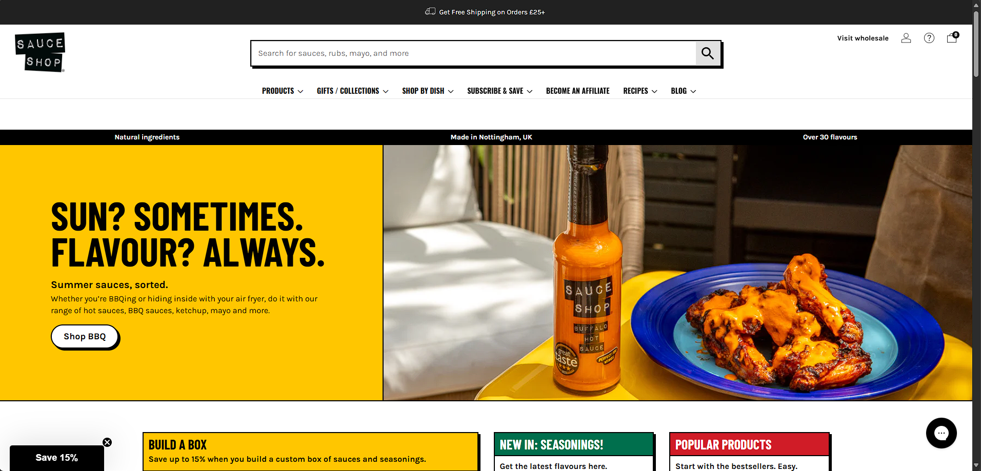
But, how do I find out the exact colours and fonts? Well, you can use the CSS Overview feature which I talk about in my other blog post here.
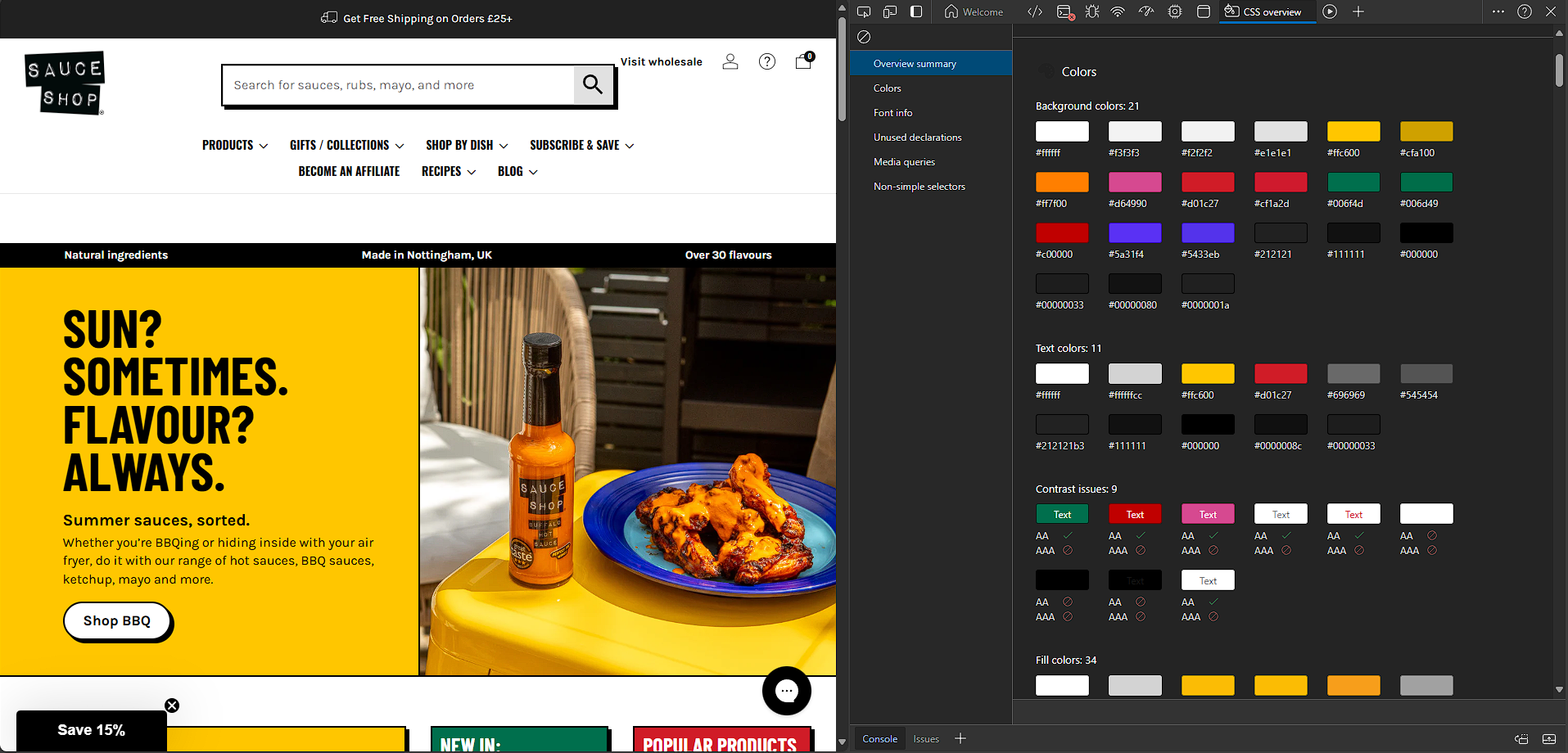
I now have access to all of the Hex codes I need to create the background image, and also the colour palette later on.
With all that info, I can build a simple layout in Figma, that looks something like this...
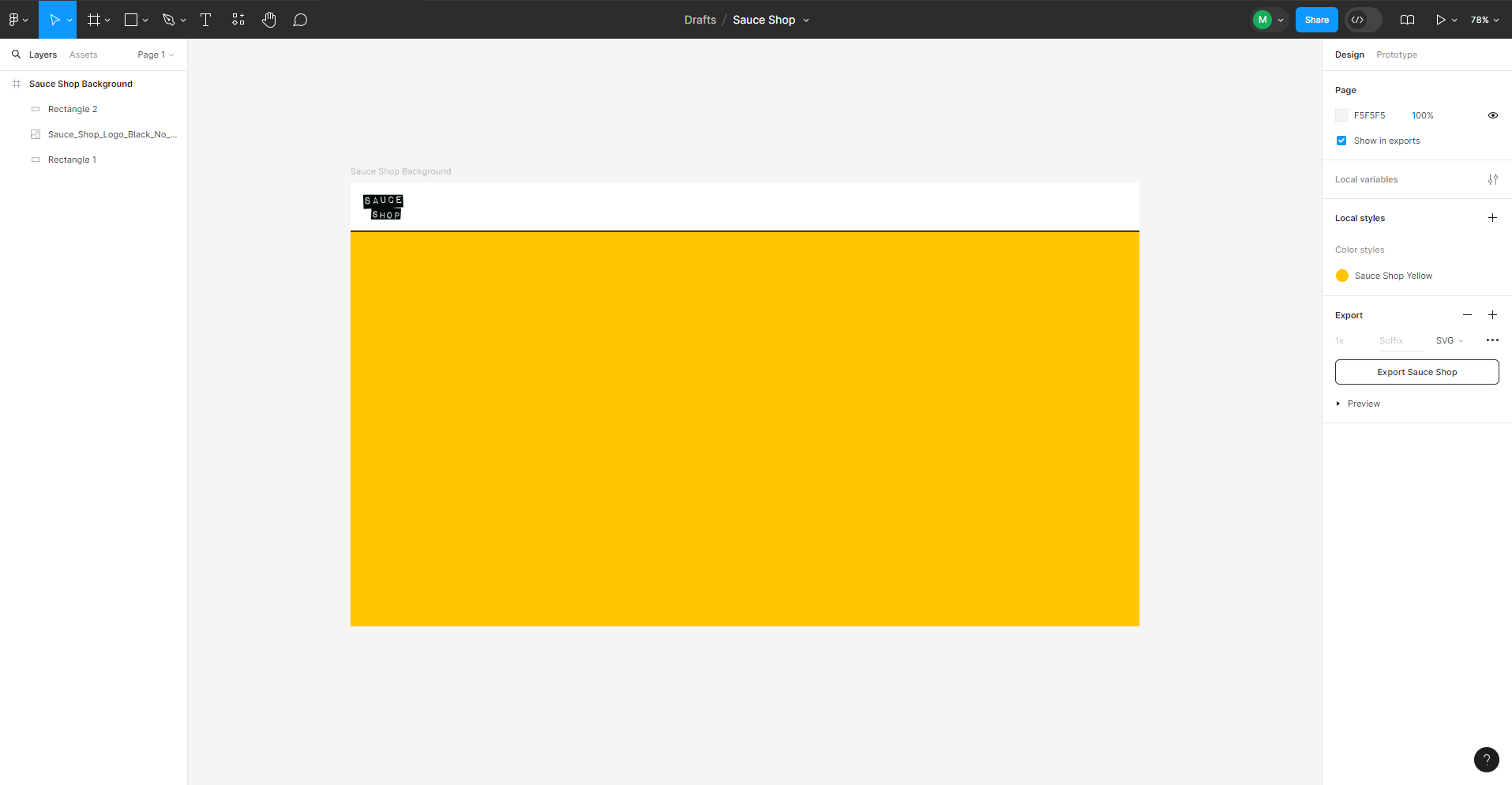
The background is now ready to be exported to SVG, ready to be integrated into the theme in the next step.
Step 2: Build a Theme Using PowerBI.Tips Theme Editor.
There are multiple theme creators out there, but the most comprehensive and my ultimate favourite is PowerBI.tips. You can control pretty much any setting you can see in Power BI Desktop using this tool.
I highly recommend paying the $3 a month to use it if you create multiple themes, it's an absolute godsend!
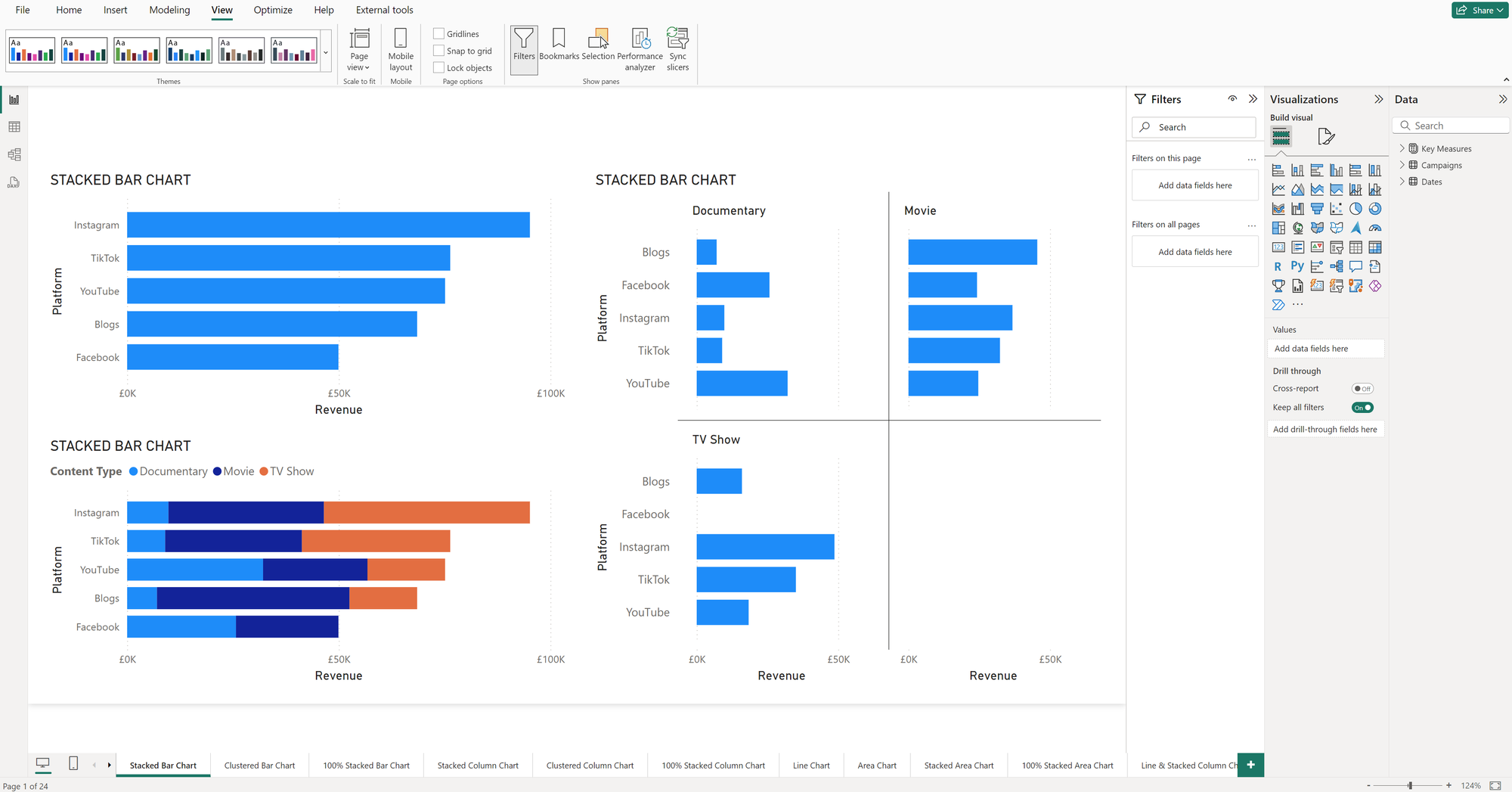
When implementing Theme First Design, you need a way to test out the theme as you go. This is where the "Theme Checker" report that I've built comes into play.
It's a Power BI report with one of nearly every visual with their default settings applied.
As you make changes to the theme, apply it to the Theme Checker to visualise your changes and see the effect of the theme in real life. You can make sure settings are being applied and if it looks any good.
This is what the default theme looks like in the Theme Checker report, read to the end to see the difference the theme makes!
Step 3: Set Page Settings & Embed Background Image as SVG
The first thing I like to do is take the backround I've created in Figma, and embed that into the report so that it automatically applies on each page, without the user having to add an image each time.
In the Properties tab, navigate to the Page settings in Global Properties and fill out the "Page background" settings.
We have to upload our SVG background image file from Figma, set the scaling to "Fit", give the image a name and set transparency to 0.
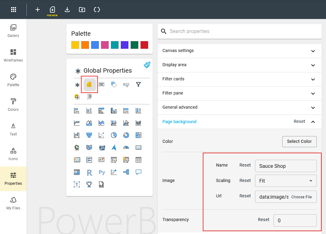
That's all done! The theme will now apply the background image on every page.
Step 4: Create a Colour Palette
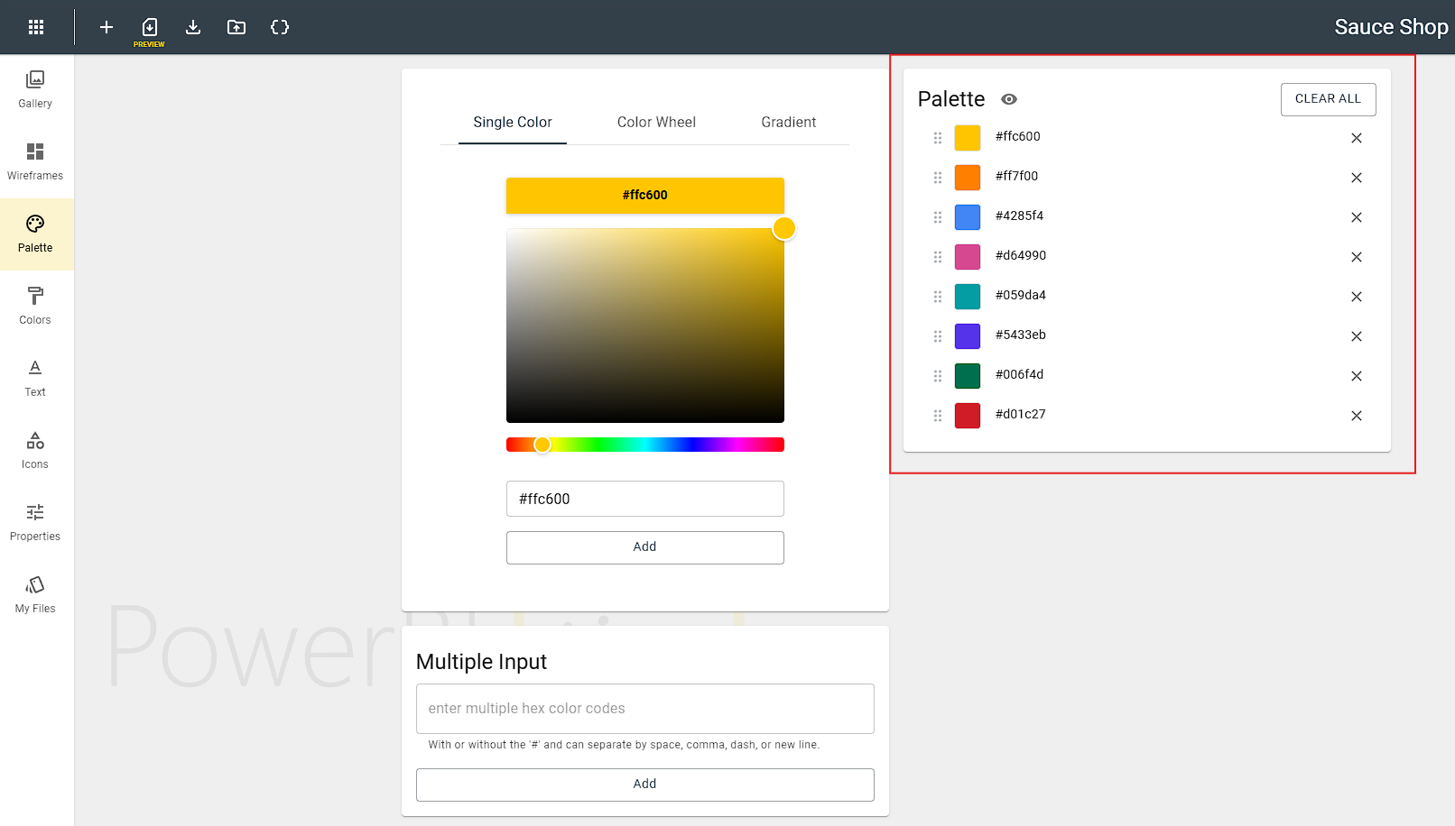
Now it's time to create our colour palette. These are the colours that will be applied charts by default.
Whenever you select a colour in Power BI desktop, these will appear as your default options in the selector, alongside black & white which are always there.
Order is important when creating a palette, so put your most prominent colours first, and be careful not to add clashing colours next to each other.
Step 5: Select Fonts or Add a Custom Font
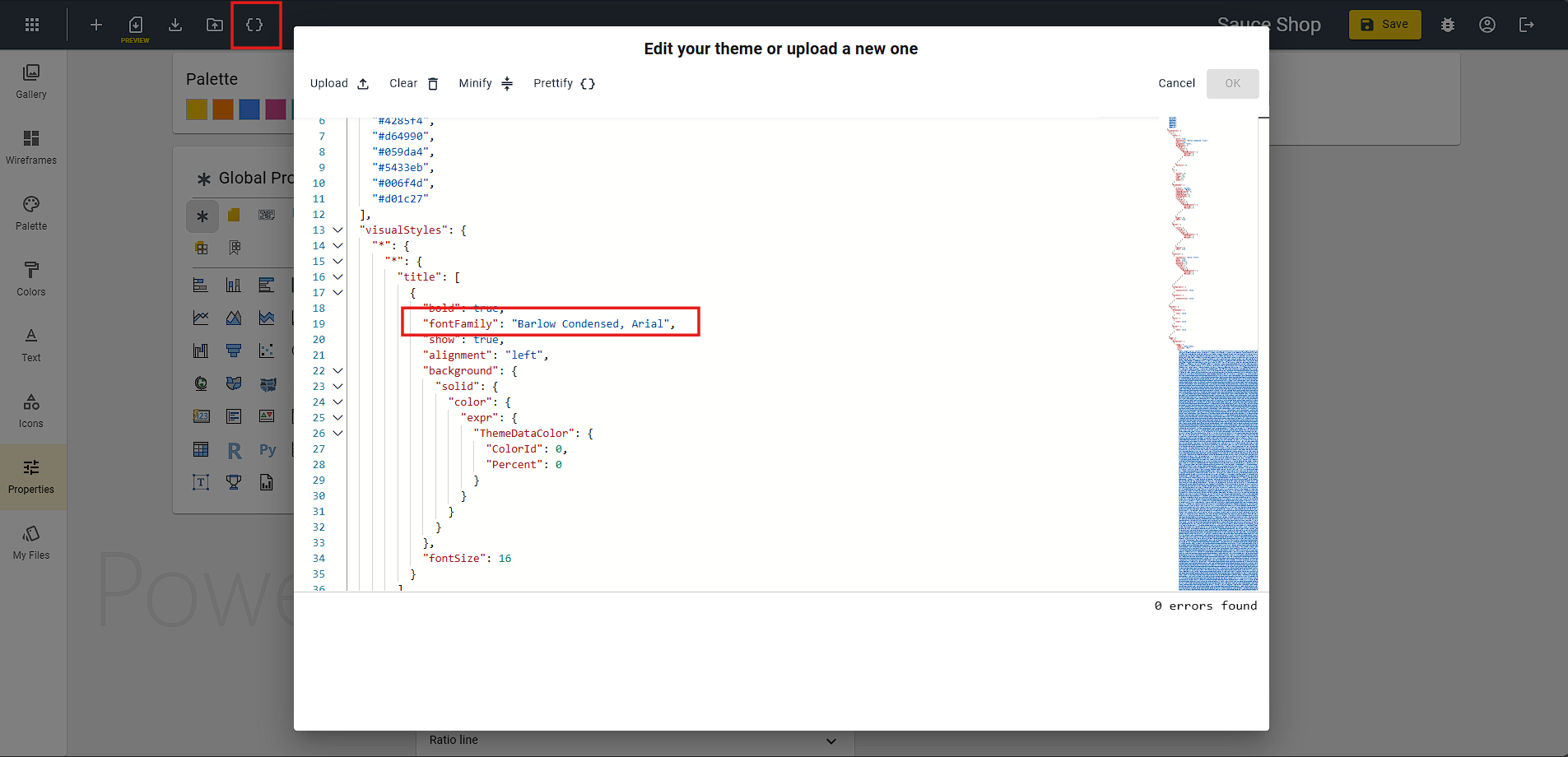
Using the CSS Overview trick again, I can see that they are using 2 custom fonts, "Karla" and "barlowcondensed-bold".
I'll need to install these locally on my machine so I can bring these into the report later on. I'll also set some fallback fonts for users that don't have these fonts installed.
This is one thing that the Theme Editor doesn't currently allow from the GUI, so I need to go into the code editor for this trick:
Step 6: Set Visual Effects, Borders, Shadow, Glow, Padding & More
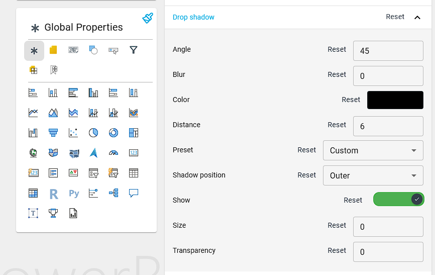
When you create a new visual in a report, there's nothing more annoying than having to go into the settings to apply the shadow, borders and backgrounds.
If you are doing this manually, you will end up with inconsistencies between visuals eventually. So let's fix that.
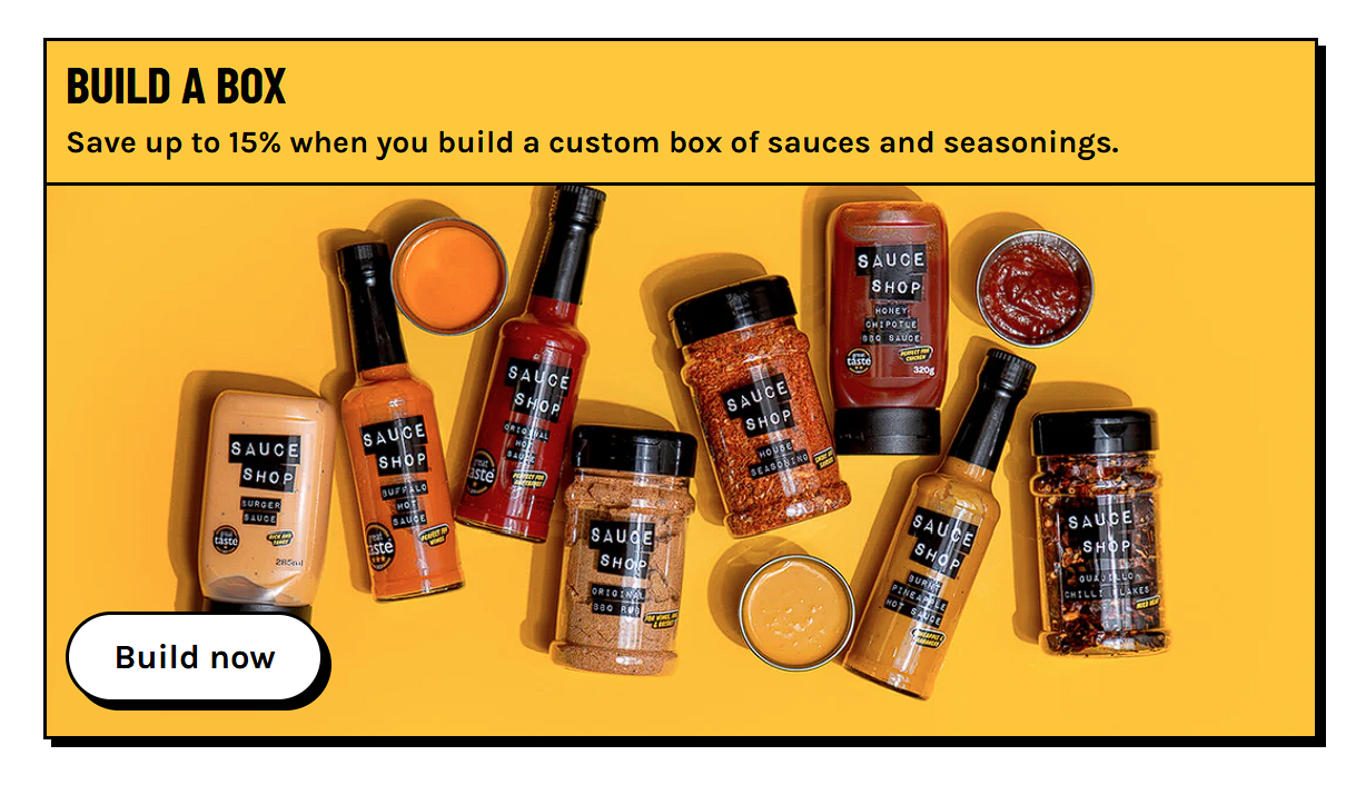
In global properties, I'm going to add a custom dropshadow to recreate the effect on the Sauce Shop website.
Step 7: Set Individual Visual Settings
It's good practice to set properties at the global level, but sometimes we want to adjust some properties for an individual visual. Here are some examples...
Table & Matrix
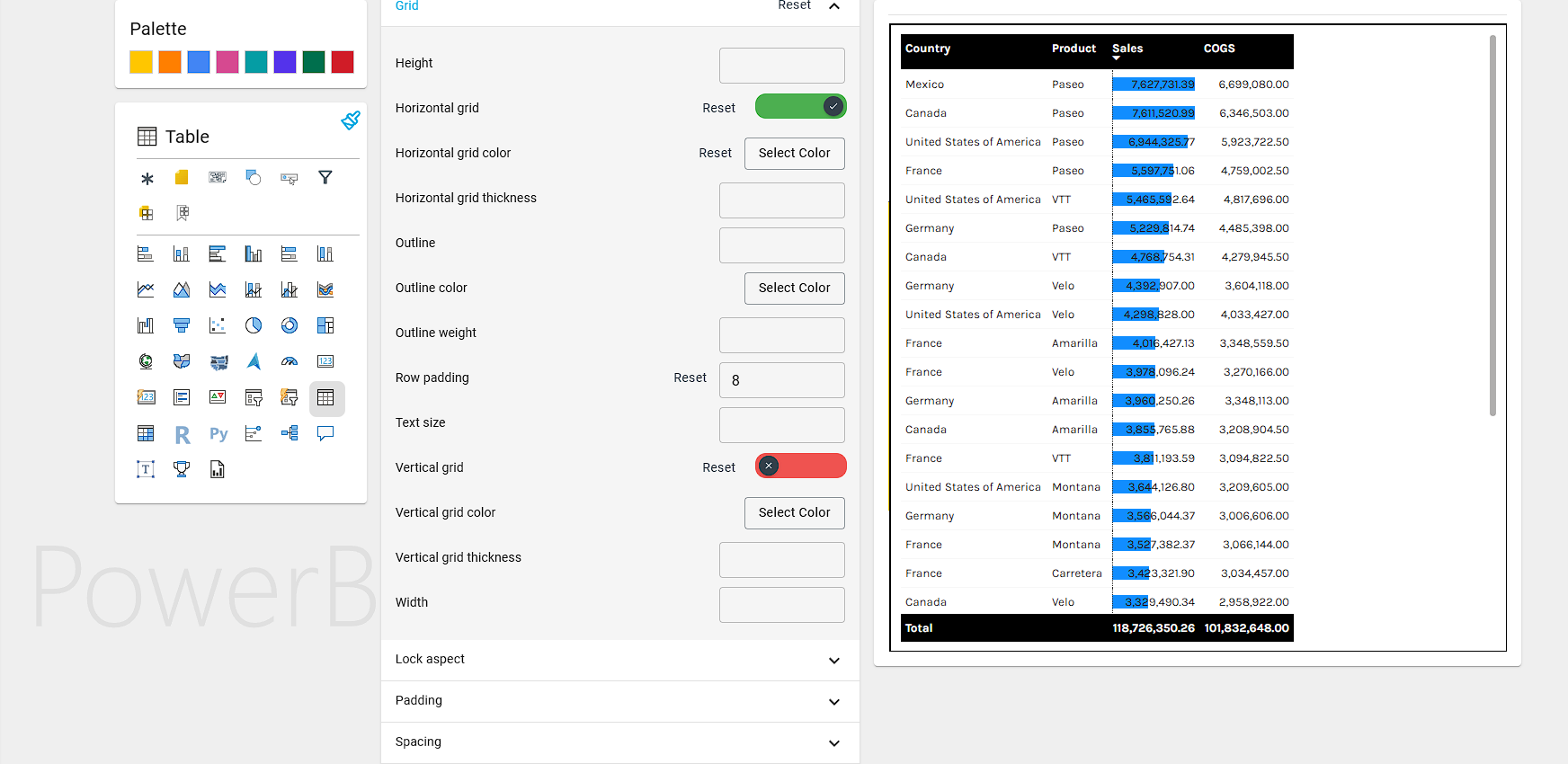
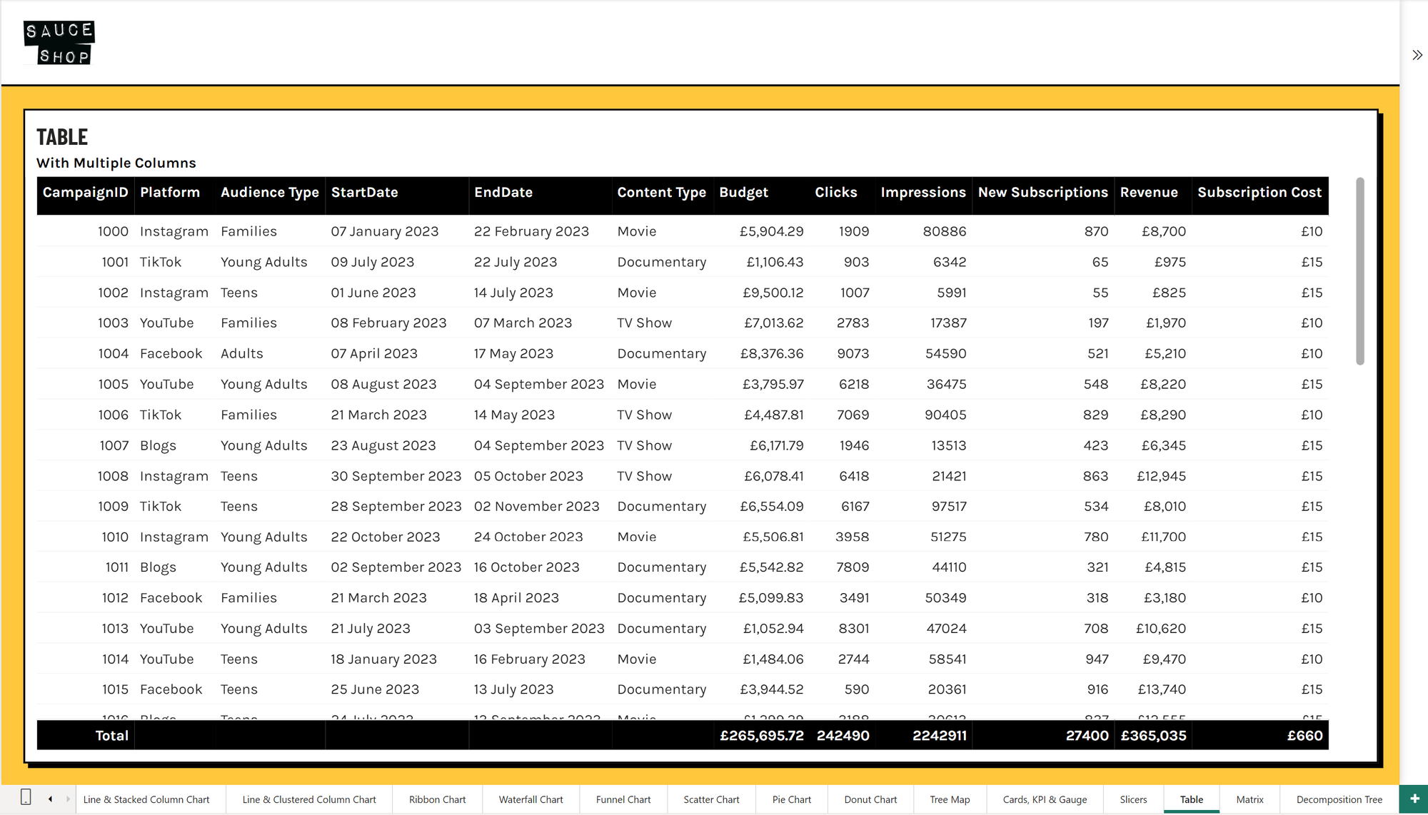
I'm not a huge fan of the default table look, so I'm going to make some adjustments. Let's up the row padding to 8 to give the table some room to breath, let's remove the vertical grid, and a really faint horizontal grid and set the column headers and total row colours.
Bar Charts
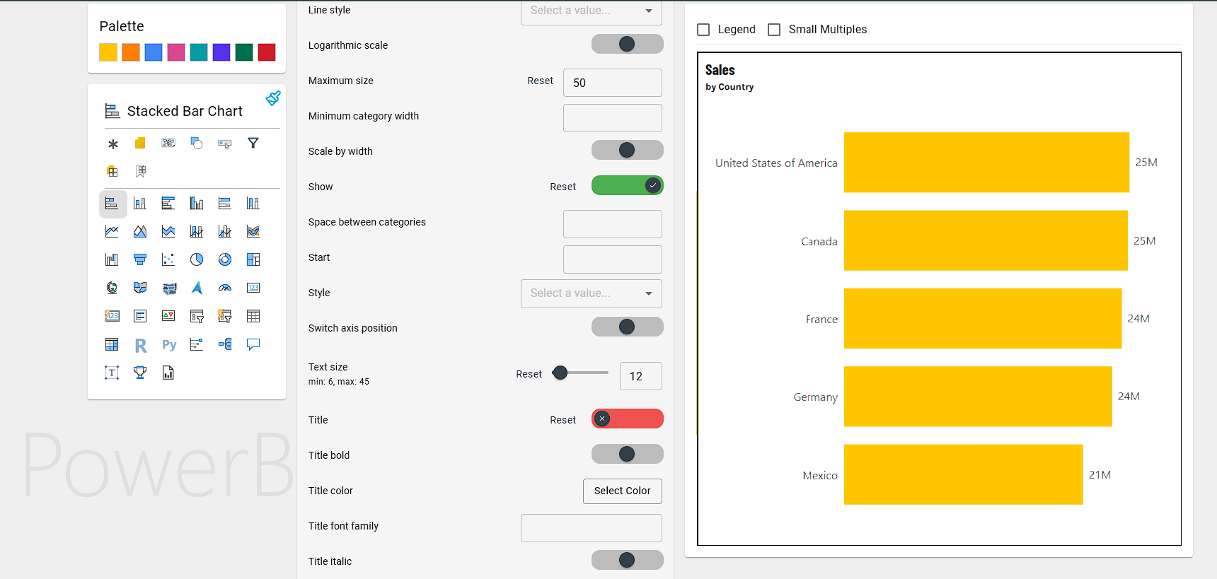
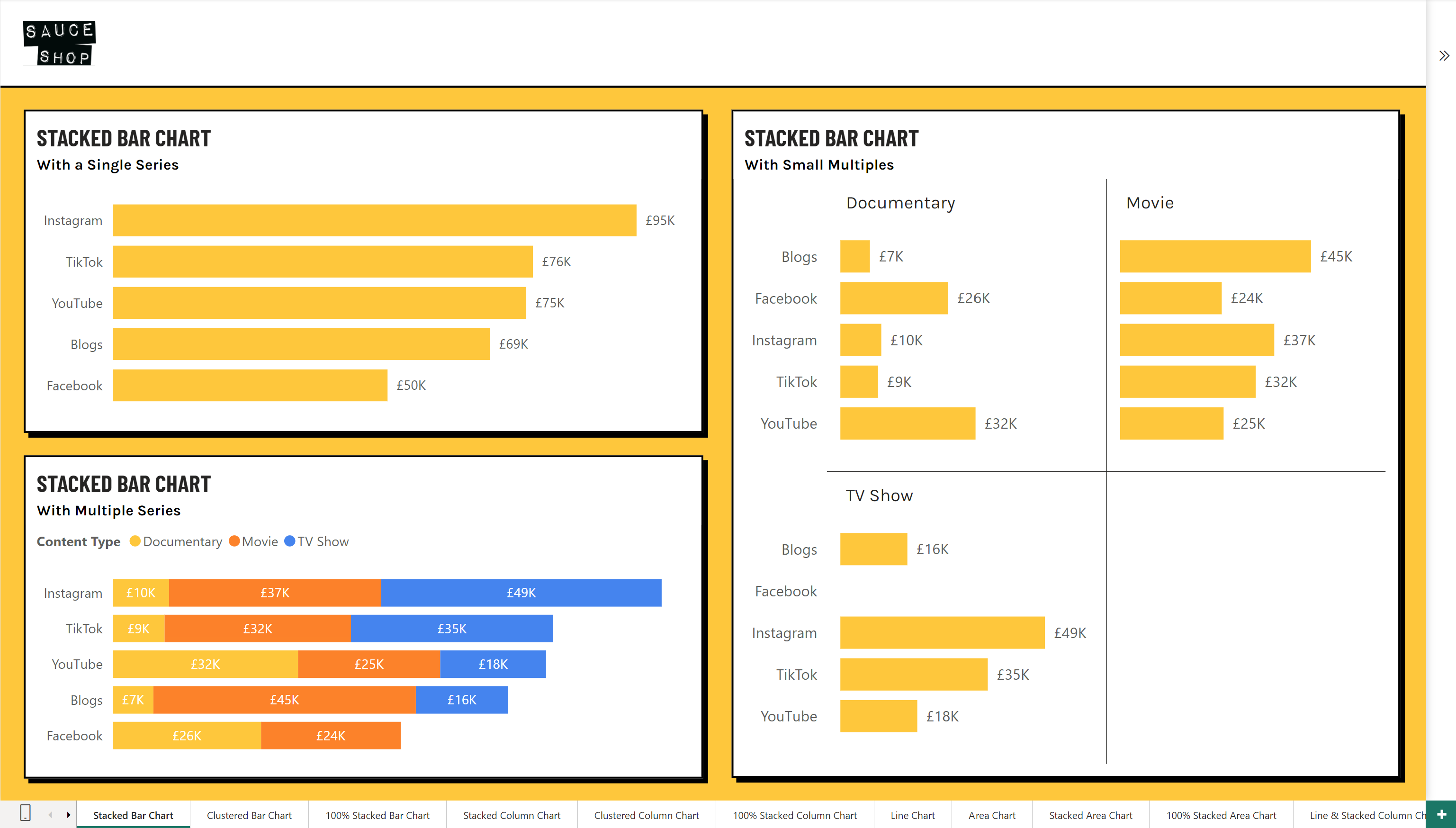
For the Sticked Bar chart, I want to declutter as much as possible. I'm going to switch off the X-axis and go with data labels instead. I'll remove axis titles, make sure the all font sizes are readable and increase the max width of the y-axis so it isn't cutting off the labels.
Step 8: Create a Re-Useable Base Template File
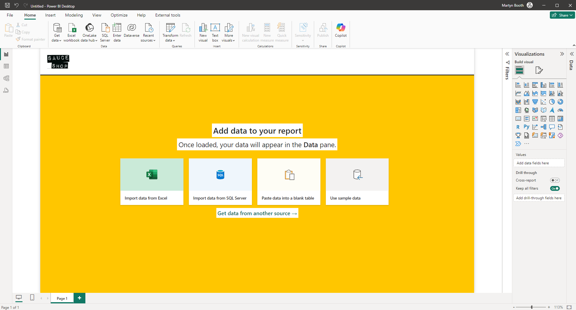
Once you are happy with the theme, you can download the .json file and import it into Power BI.
You will now see the background we created in Figma earlier, magically appear on every page. No more manually adding in the background on each page!
Now we can add in a Date table, and we will have a template ready to re-use for future reports!
This means you can give this template to Colin from accounts (who has zero design savvy whatsoever) and the chances are that he will be able to produce something half decent, that is at least on-brand and visually appealing.
For us Power BI devs and report creators, it provides speed and consistency. It can be quite fiddly to get right, but once you master theme creation, it's a game changer for building reports!
A couple of hours at the start of a project dedicated to the theme will more than pay for itself down the line.
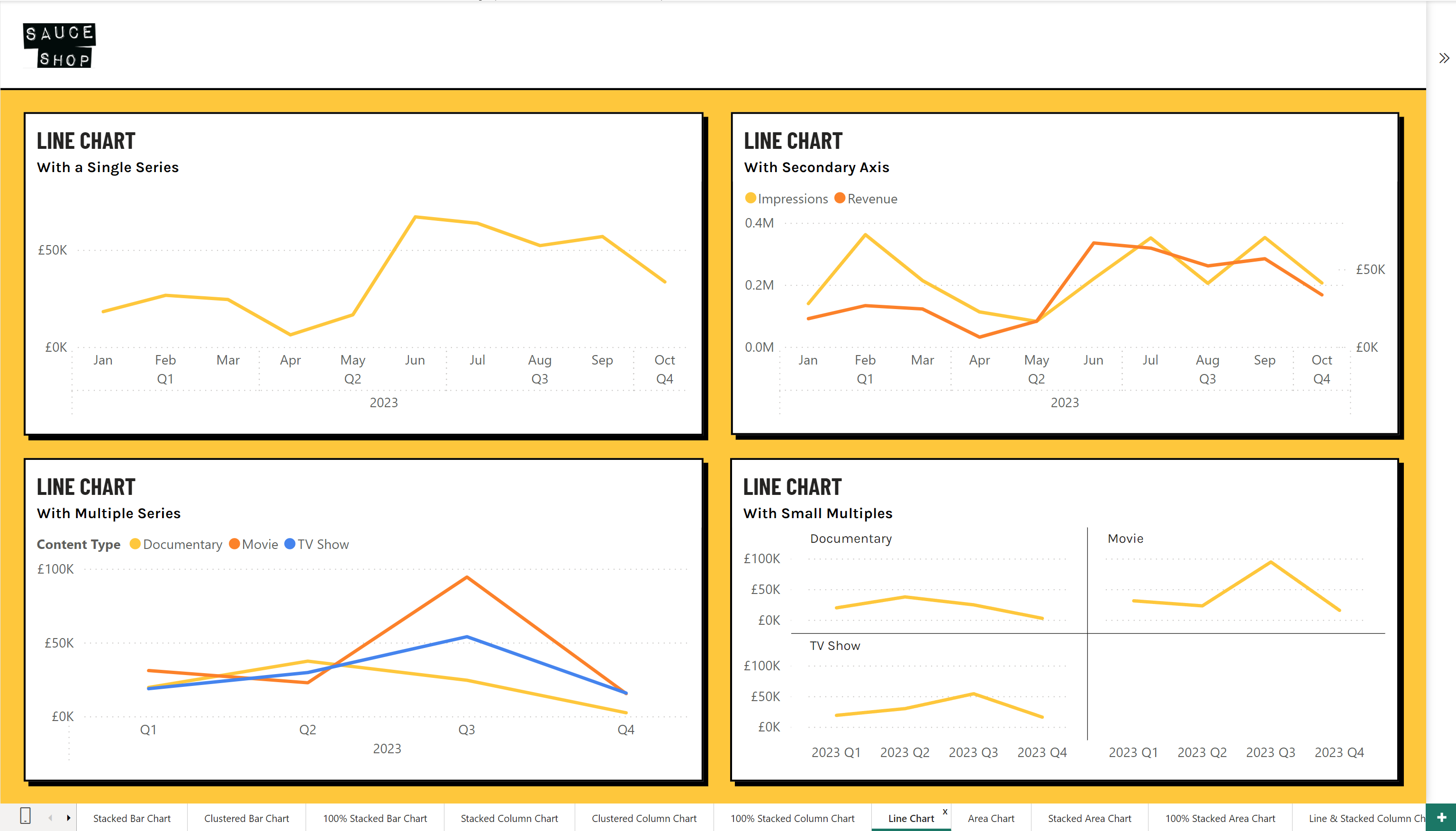
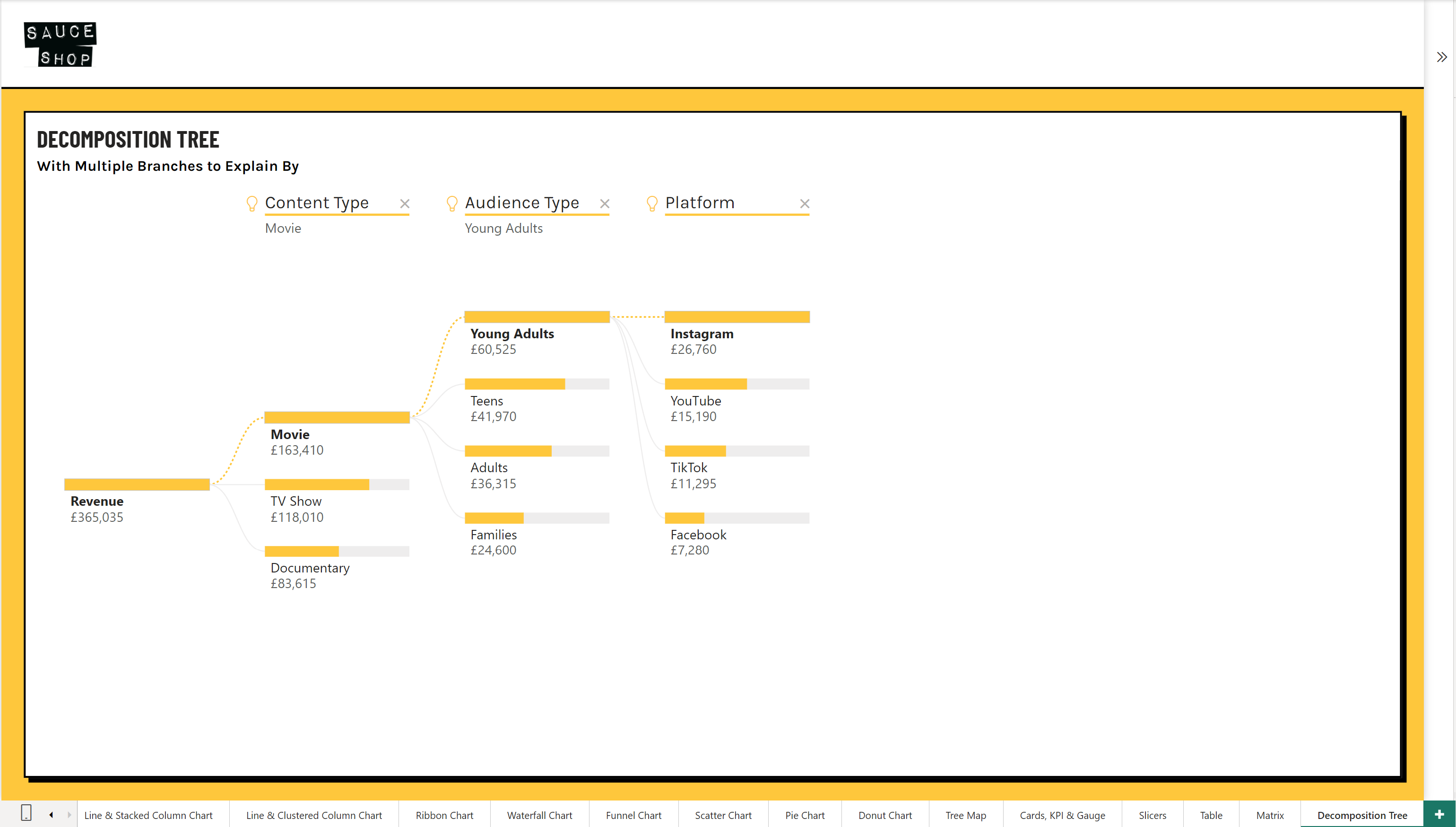
Here's how it looks using my Theme Checker Power BI File.
There's a lot more tweaking that could be done, but this is a demo so I didn't need to go in too deep, but everything you see here is controlled by the theme with no extra configuration needed by the end user.
I hope this has given you some ideas of how using themes can speed up your report development and bring some standards and consistency to your organisation, let me know your thoughts on LinkedIn!

