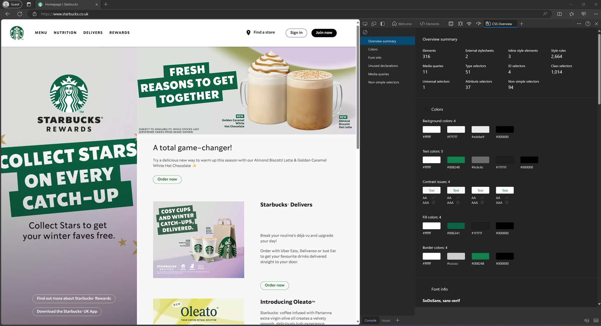
Easily Find Brand Colours with Edge's CSS Overview Hack
Still relying on an eye dropper tool to pick out brand colours for your Power BI reports? Well, brace yourselves, because I've stumbled upon an absolute gem of a hack to help...
For years I’ve been using an eye-dropper browser extension to individually pick colours from websites to build up a brand colour palette.
Then one day, I stumbled across a sneaky feature in Edge’s developer tools.
It’s called CSS Overview and it’s a Power BI Developers dream!
How To Use CSS Overview
- Open Microsoft Edge and navigate to the company’s website that you are interested in.
- Right-click and select "Inspect" to open the developer tools (or press F12).
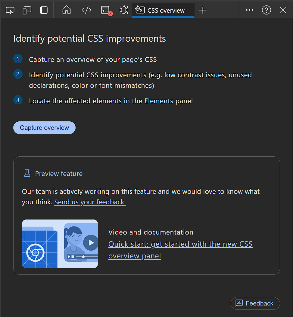
- Click on the ➕ icon to view “More Tools” and select "CSS Overview".
- Click on “Capture Overview” and let it do it’s magic.
What it gives you
Colours
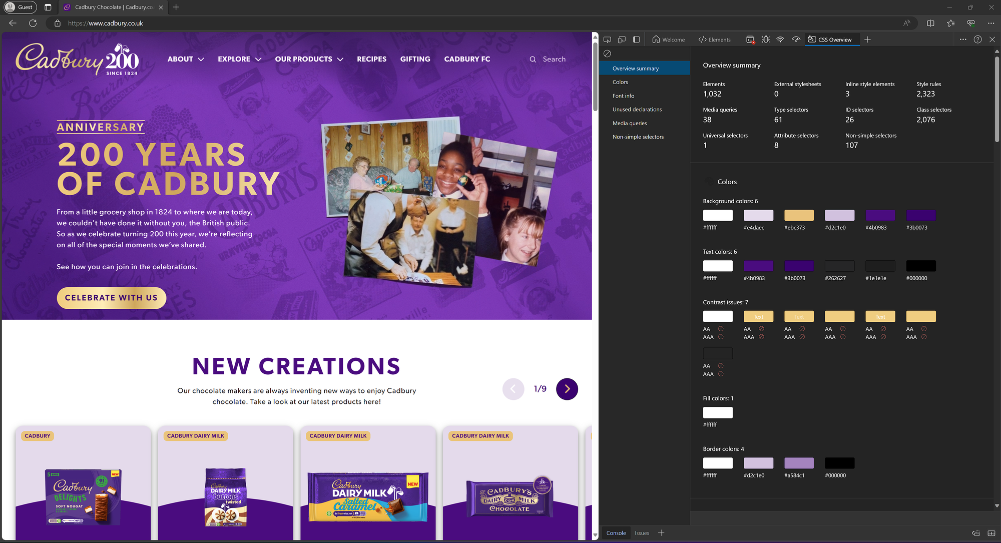
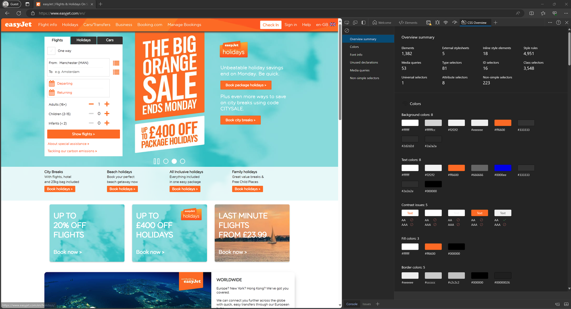
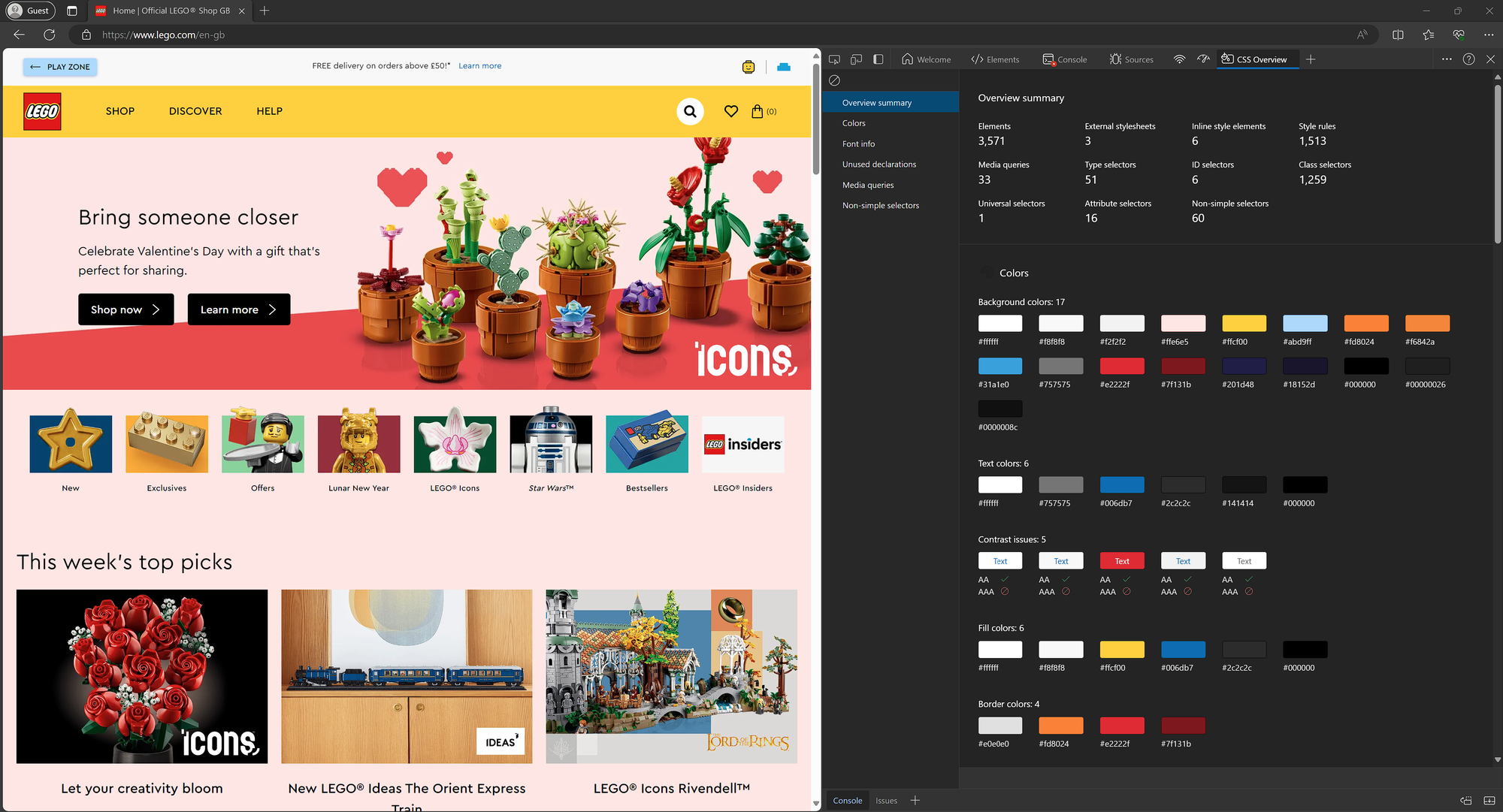
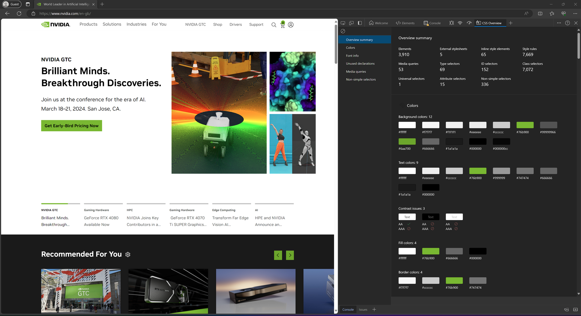
You get all the colours (with easy to copy HEX codes!) for all the backgrounds, text, fills and borders used on the web page.
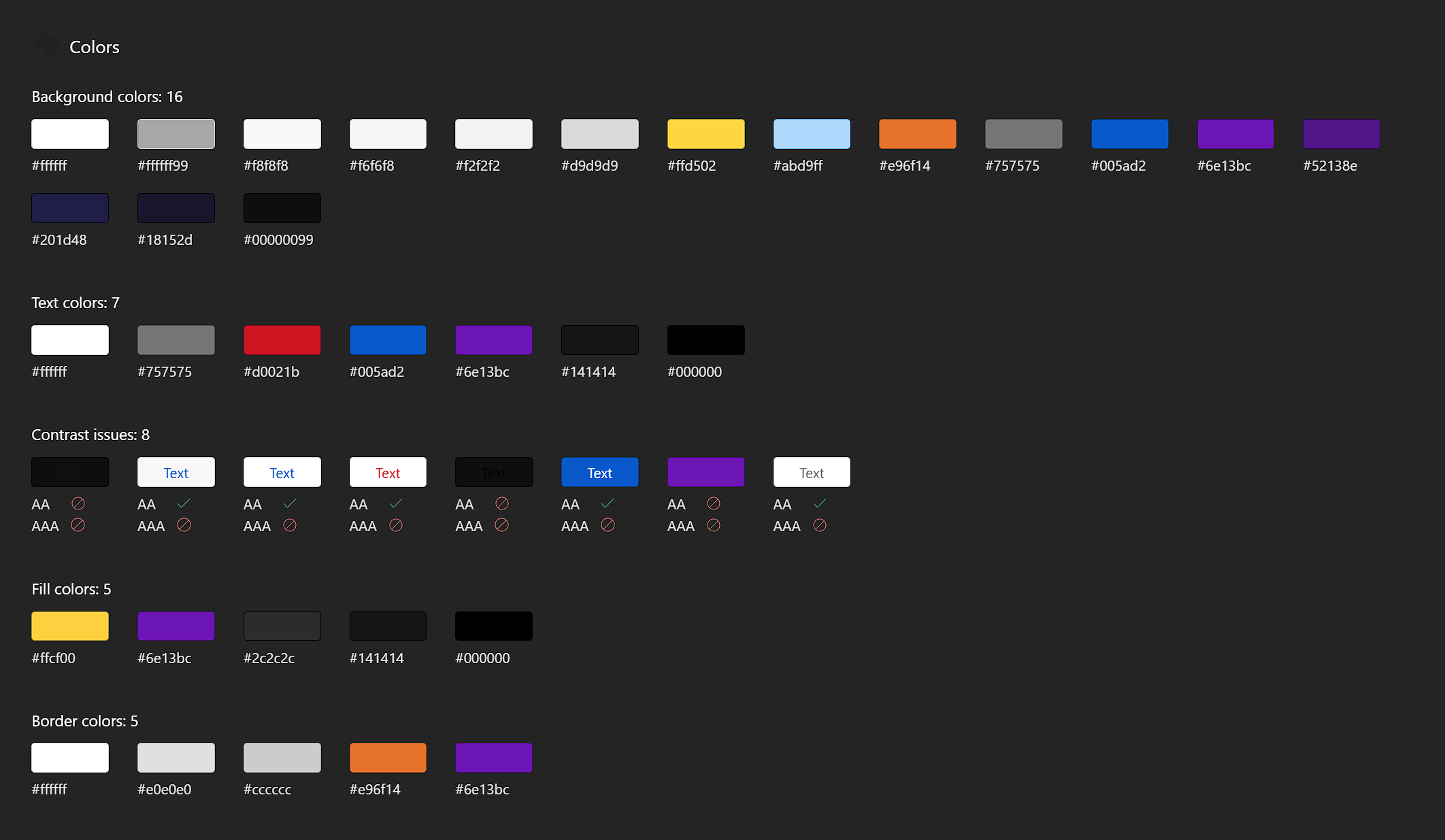
Contrast Issues
It highlights any contrast issues so you can spot which colour combos not to use, aiding you in creating not only brand-aligned but also accessible reports.

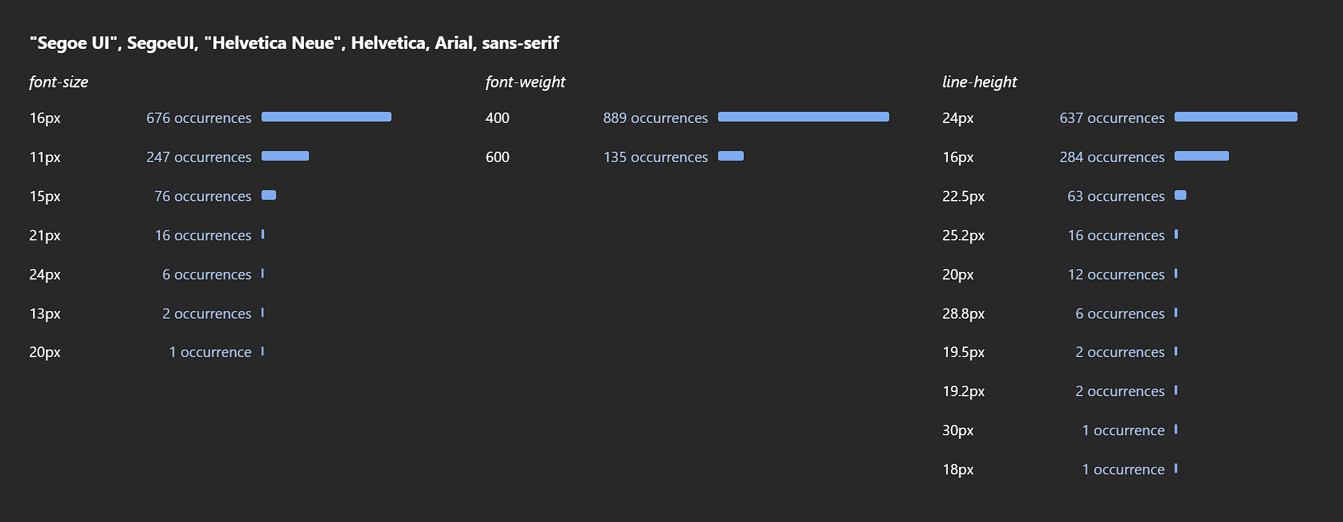
Fonts
You can see which fonts a website is using, including any fallback fonts. If you are lucky, the fonts they are using are one of Power BI's native font.
If not, you could look into incorporating custom fonts into the Power BI theme, see my blog on custom fonts here: Replace me
Why It Matters
As Power BI experts, we know that details matter.
Using the correct brand colours and fonts is not just about making stuff look “pretty”, it's about maintaining consistency, professionalism, and brand identity in every report you craft.
When I was first starting out, I spent ages perfecting a “Sales Dashboard”, put loads of thought and effort into the report and thought it looked amazing.
The first thing the CEO said in an unamused voice was “that’s not the right shade of orange” 🤦 FFS!
Since then, I’ve always sweated the small stuff and focused on doing the little design details well.
So, stop guessing at colours and add this hack to your Power BI toolset, the marketing team will love you for it!
