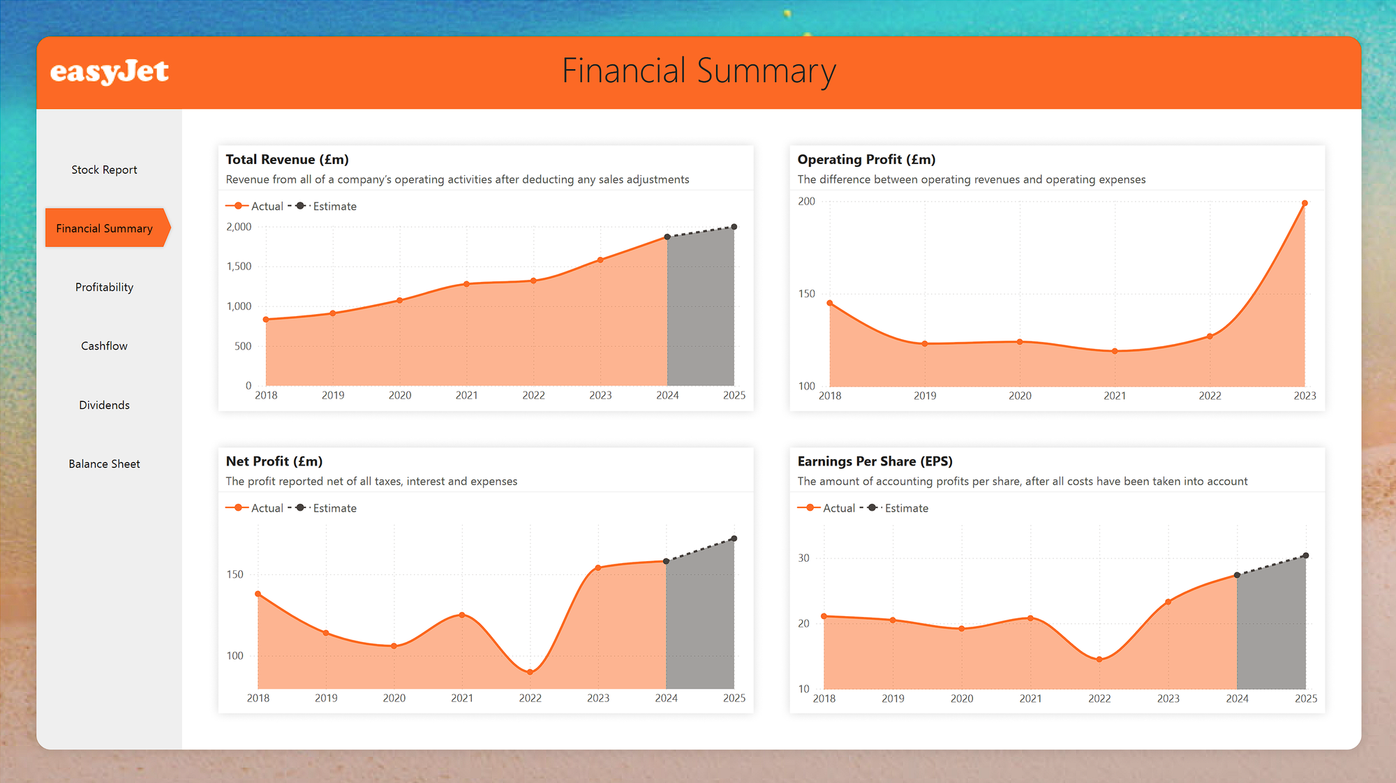
Stock Report

Stock Report
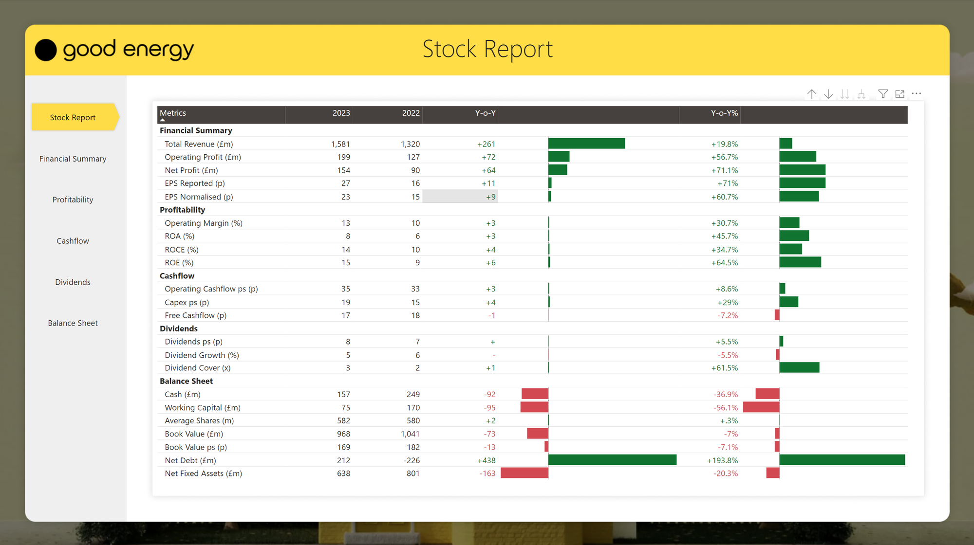
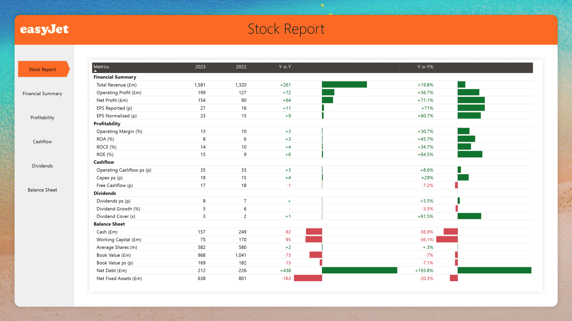
A reusable report for analysing publicly available data on listed companies on the London Stock Exchange.
Open in Power BIBackground
Back in 2020, I landed a BI Developer role in a fintech company called Wealthify, an investment app that made it really easy to invest your money in funds to suit your risk profile.
This sparked a new interest and opened up this new world of investing to me. I consolidated all my old pensions and started a Junior ISA for my daughter. But, after 3 years of "meh" performance using Wealthify, I thought to myself, I could probably do better than this by choosing my own stocks and managing my own portfolio.
This set me on a road of discovery, learning about the stock markets, devouring books on trading strategies, learning how to interpret balance sheets and company accounts.
I settled on a strategy of investing in small-mid cap companies on the London Stock Exchange, and so far I'm managing to beat the returns I'd get from the bank (touch wood).
Anyway, this got me thinking, is there a better way of visualising this company data, rather than just in boring tables?
Thought Process
The idea was to create a re-usable template that could be quickly adjusted to any listed company, pulling data from Stockopedia.
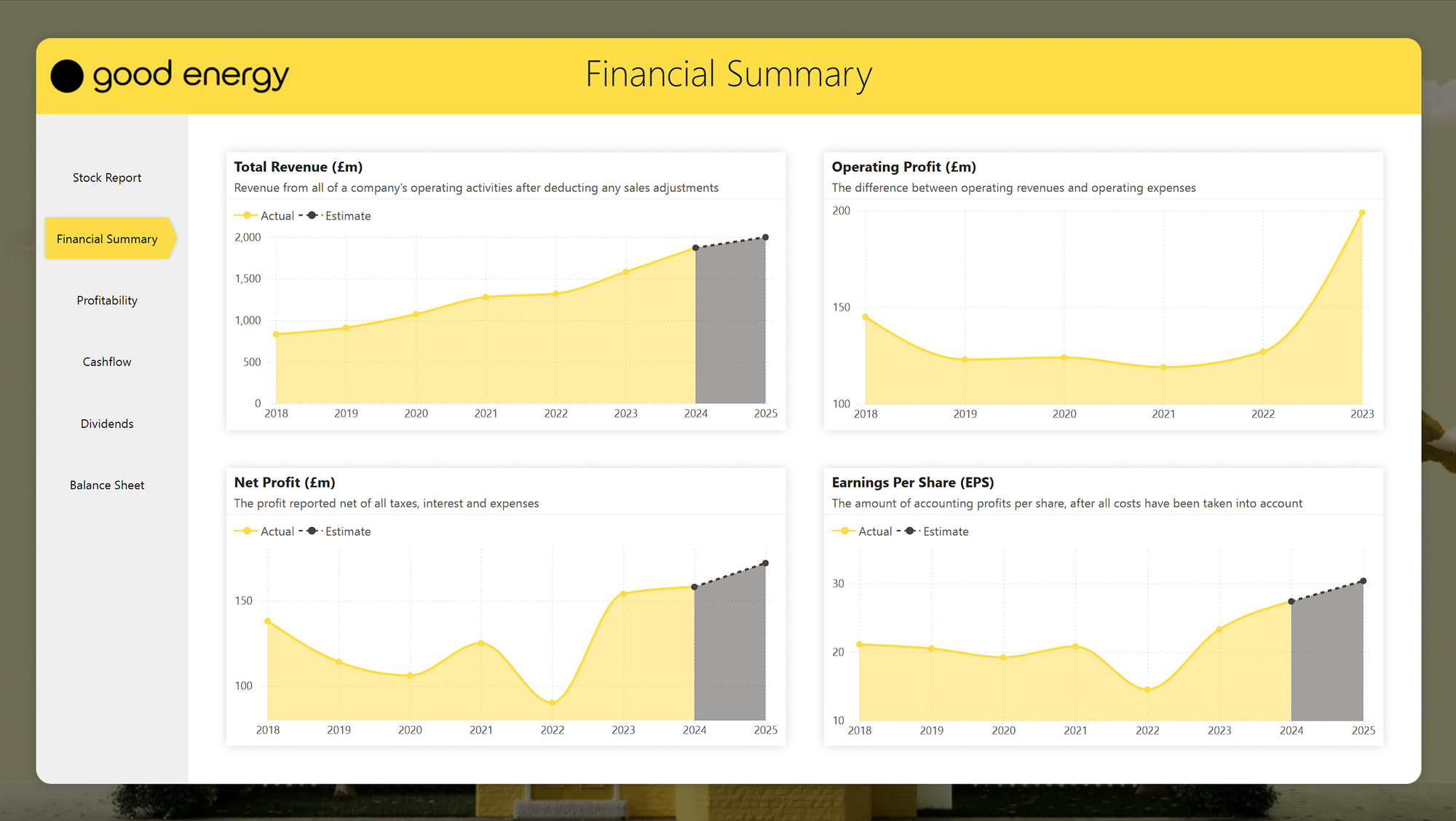
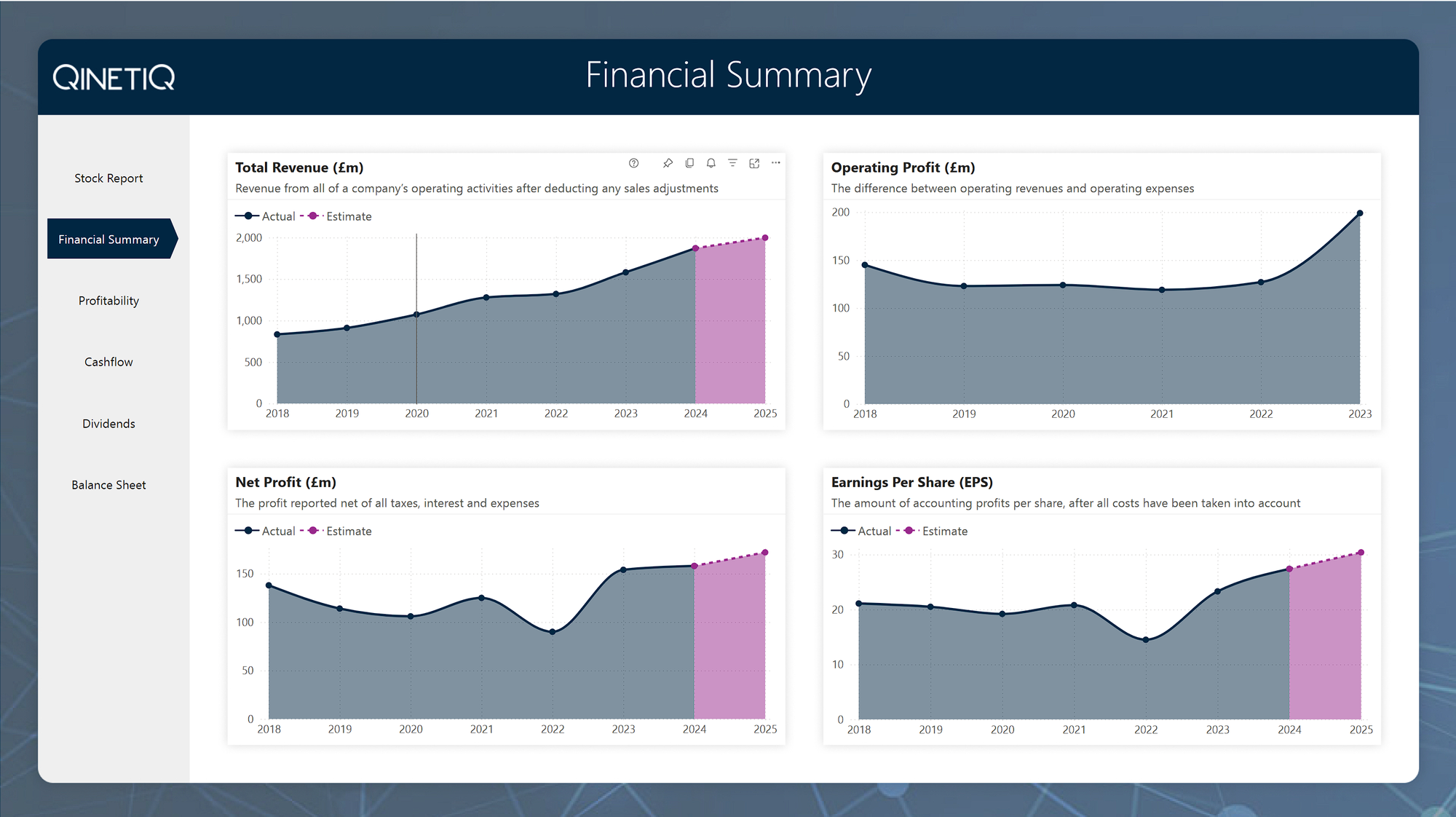
By using Figma to create the backgrounds and adjusting the colour pallette in the theme to match the companies branding, a report for a new company would be ready to go in under 15 mins.
While this was just a demo, it was part of a wider push as my role as a consultant, to demonstrate to the team that we can quickly deliver superb looking reports for clients, or quickly spin up a branded demo for a customer, using reusable assets such as this.
Features Used
Figma
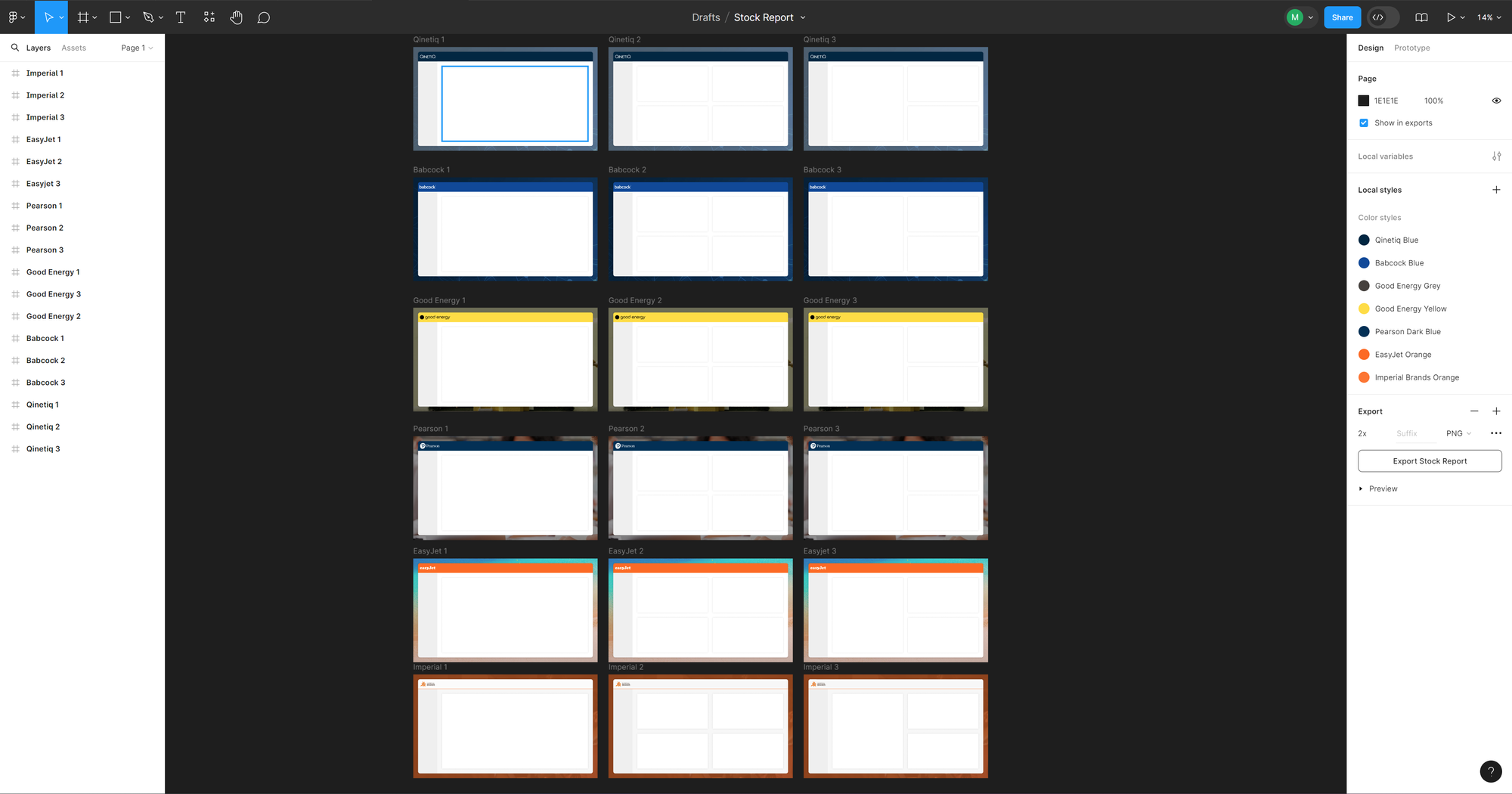
Used to design 3 backround templates for each company. Each time a new company was needed, I could duplicate the pages, apply some new branding, export to JPG and swap the background images in the PBIX file.
Page Navigator
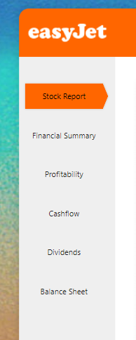
For demos like this, I like to build my own custom navigation. In this case I used Power BI's native Page Navigator feature and styled it with hover effects to give it a familiar and responsive feel.
Error Bars
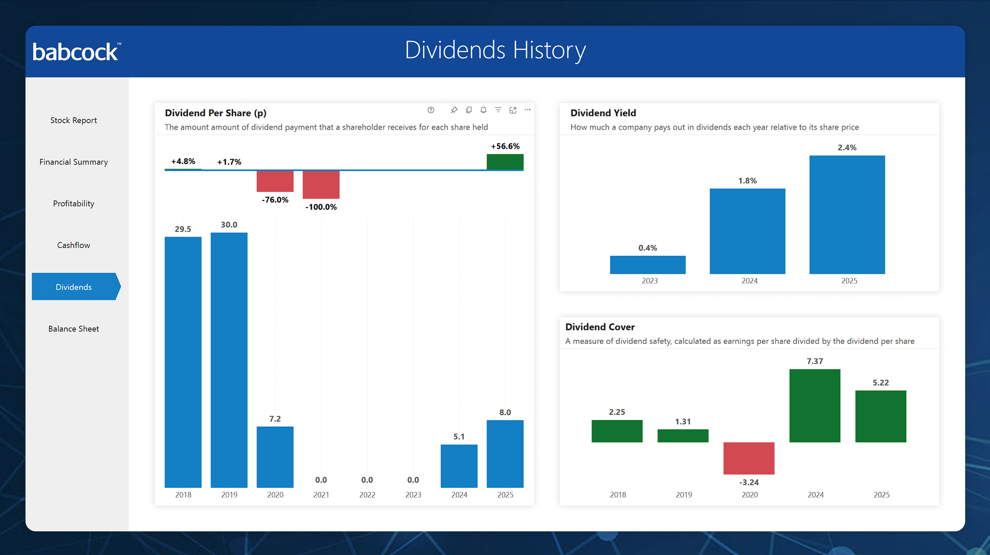
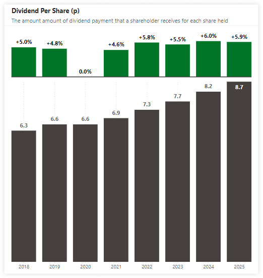
I've used the error bars feature on the "Dividend Per Share (p)" visual to highlight the growth between previous years.
Decluttered Charts
I took inspiration from the amazing "Storytelling With Data" book by Cole Nussbaumer Knaflic throughout this report, keeping the charts clutter free.
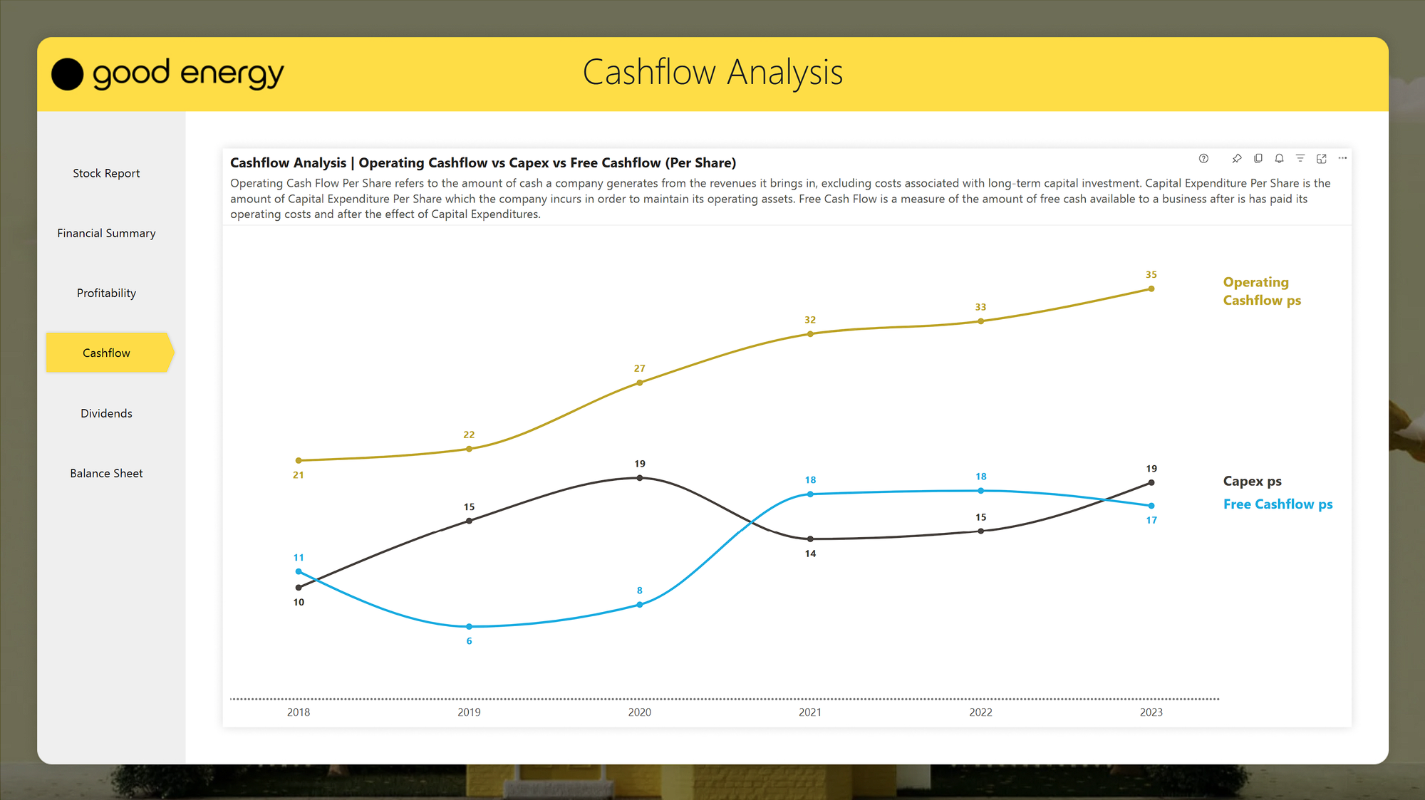
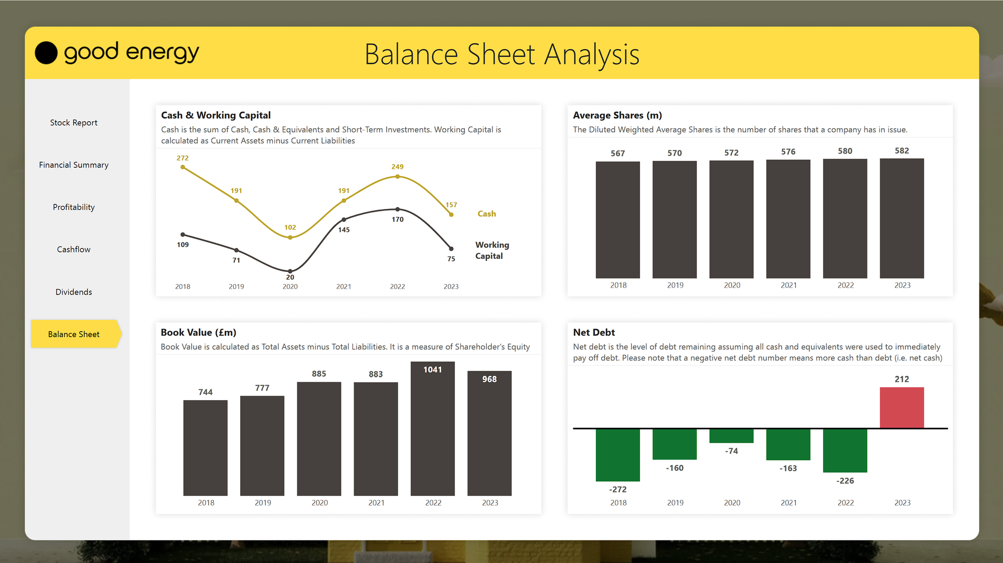
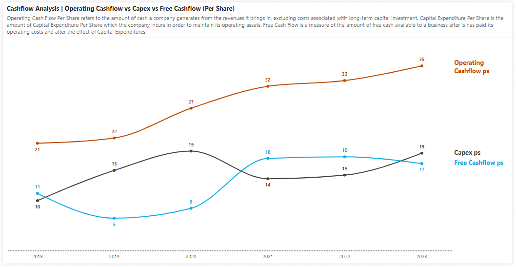
The example below gets rid of the y-axis and legend in favour of applying series labels directly on the lines with colour coded data labels to easily distinguish between them.
Notice also the descriptions in the subtitles explain what everything means, so end users understand what they are looking at.
Conditional Formatting on Charts
Sometimes, a bit of colour helps the reader to quickly understand what they are looking at.
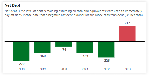
In the example of "Net Debt" below, conditional formatting is used to explain that a negative number is actually a good thing, and a positive number is a bad thing. Without colours, at a first glance you would likely assume the opposite.
